
by Gene Crawford | Jan 6, 2014 | Design Firm, Gallery
The new Adaptive Path website is “as always” a thing of beauty. There really is a lot going on here when on the surface it looks like a simple design. From the slight movement of the top header/navigation, to show you it’s there, down to the overall...
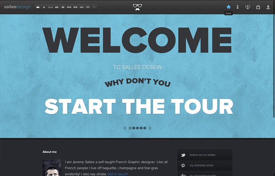
by Gene Crawford | Oct 21, 2013 | Gallery, Portfolio
Really simple execution and layout for this portfolio site but overall I really dig it. Slight animation on the text and then the slight parallax on the top most background image give it some really nice details. Down to the bottom with the skills graph – this...
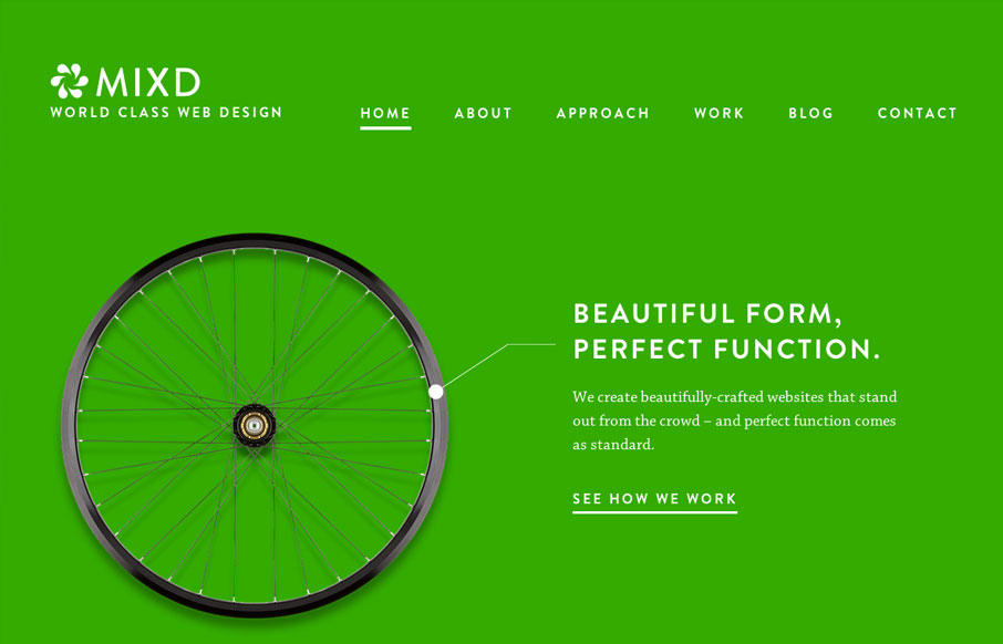
by Matt Keogh | Oct 8, 2013 | Gallery
This site shows the agency’s design philosophy by comparing their online design work to simple, functional, perfectly designed offline products. Sometimes the simplest ideas are the best. This concept is reinforced through the website by using bold, strong colours, an...
by Gene Crawford | Oct 7, 2013 | Blog, Gallery
Nicely executed with tons of little details. The site is clever and really show’s off the designer’s sense of humor and quality of work well.
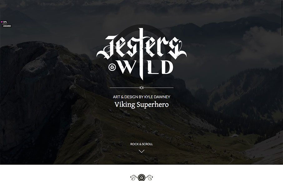
by Jay Barry | Aug 27, 2013 | Gallery, Sports/Recreation
The simple, slightly art deco vibe of this site is really cool. The type is beautifully done and its great how the site engages as you scroll down. It really makes you want to scroll down to the bottom, and there’s even a bit of a punchline at the end. That...