
by Gene Crawford | Apr 1, 2014 | Gallery
Nice effect with the background video and how it stays in place as you scroll down. I really like the contact form and how the field labels are handled – very nice.

by Gene Crawford | Mar 28, 2014 | Gallery
My favorite part of this design is the hero image area. I love how it slides down and fades as you scroll down the page. Then check it out when you resize it for the mobile screen widths. Very clever design.
by Gene Crawford | Mar 27, 2014 | Gallery
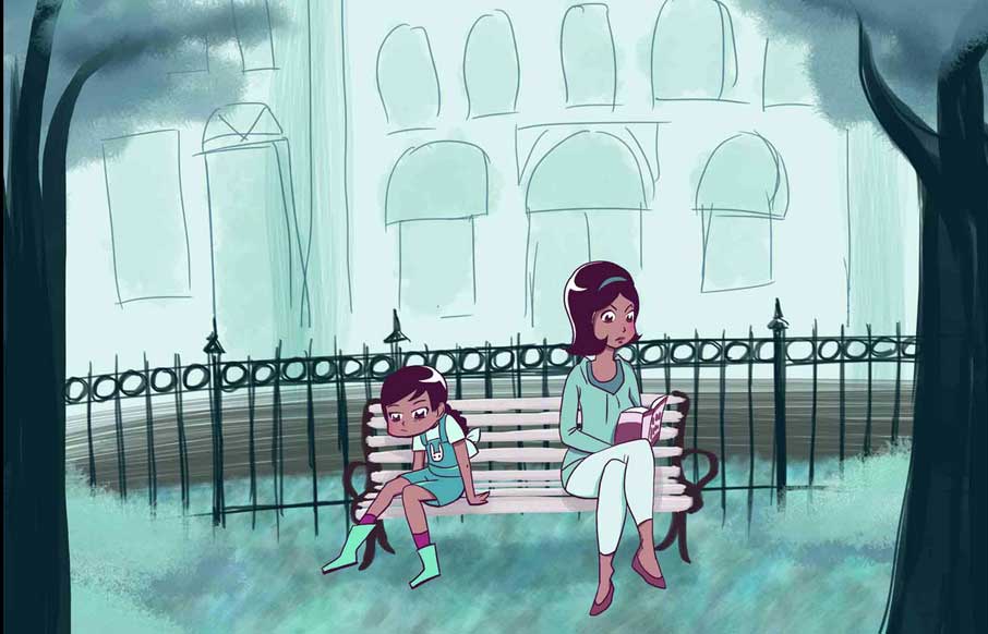
A very intriguing site by Rachel Nabors, an interactive telling of the Alice in Wonderland story. You’d better just take a look and see what you think for yourself. An interactive take on Lewis Carroll’s classic tale, lovingly crafted in HTML5, CSS3, and...
by Gene Crawford | Mar 27, 2014 | Gallery
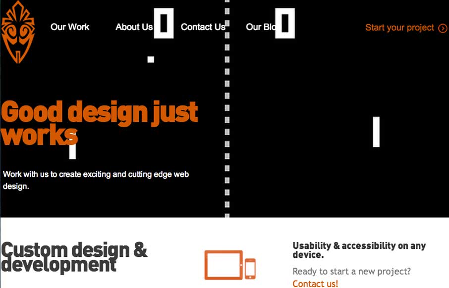
Overall the layout of 3 One Seven is intense visually. There’s blocks of imagery competing for your attention – which as I review this site appears to be the point of the design. It’s successful in that the images are actually compelling visually and...
by Gene Crawford | Mar 26, 2014 | Gallery
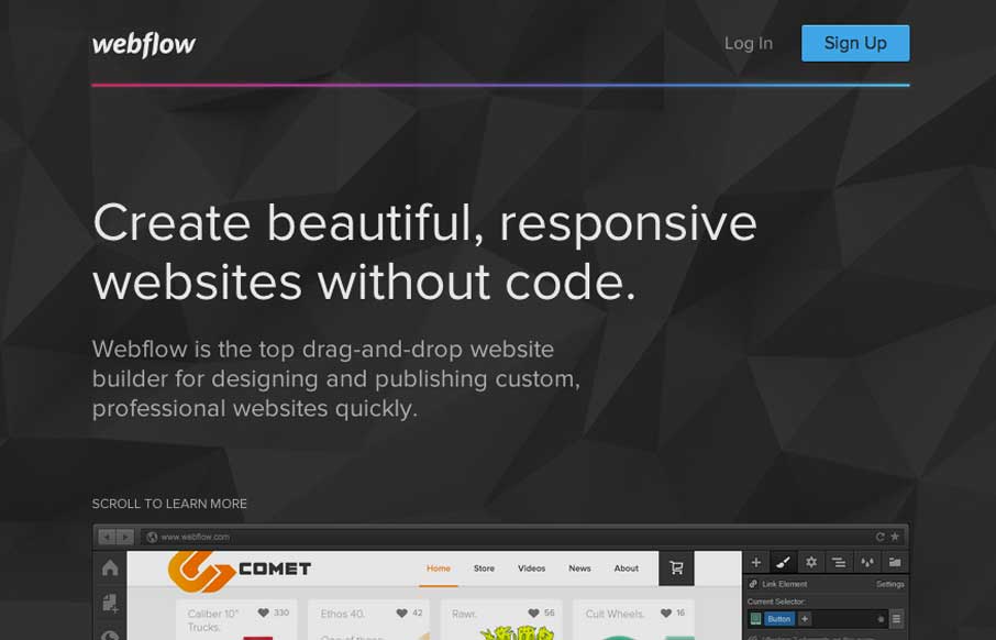
Pretty much a flat organized page here with the Webflow site. It works well in this case, considering their audience. I love how the main featured image fades out as you slide down the page. The signup form all lined up horizontally looks very quick to get through...
