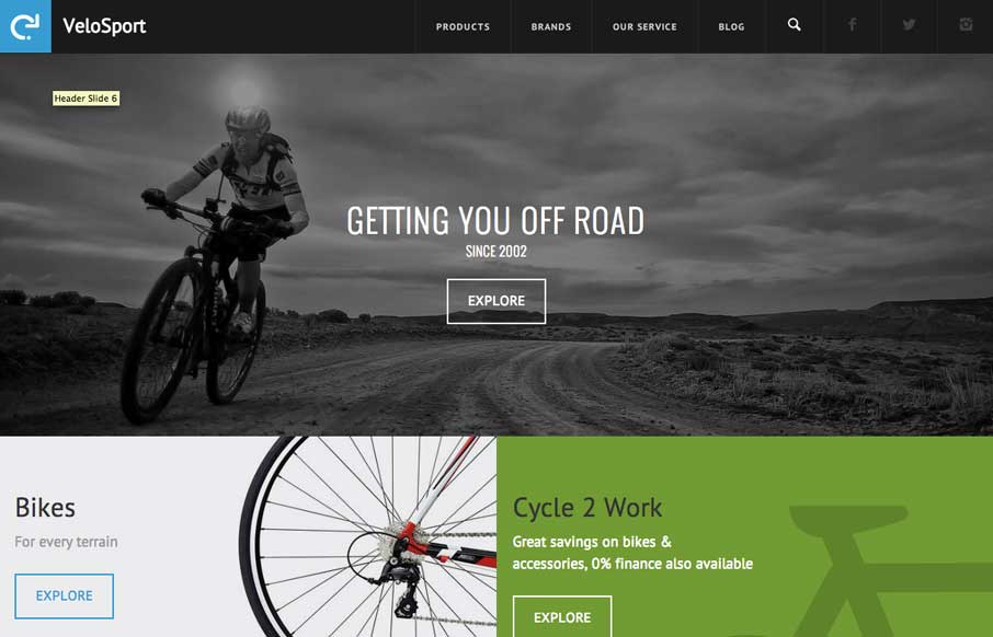
by Gene Crawford | Jun 12, 2014 | Gallery, Sports/Recreation
http://velosportonline.com/ Pretty sick bike site. I like the bold blocky layout and the info is organized in a clear and easy to consume way.

by Gene Crawford | Jun 6, 2014 | Design Firm, Gallery
I really like the animated details and some of the off-kilter layout items on this site. It’s just square enough and just animated enough to make me stop for a while and poke around. Job well done!

by Gene Crawford | Jun 2, 2014 | Gallery
I love narrative in a site design. This site is such a good narrative experience to scroll through. Well done.
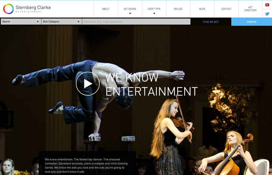
by Gene Crawford | Jun 2, 2014 | Gallery
Well. The new responsive site for entertainment company @SternbergClarke is rather striking: http://t.co/WwJ2RMiAFc (via @leejamescasey) — Responsive Design (@RWD) May 7, 2014 One of the better fixed nav transforms i’ve seen. A quite nice layout as well...

by Gene Crawford | Jun 2, 2014 | Gallery
We don’t normally post splash pages or coming soon pages, but in this case. Dang, it’s a neat one.