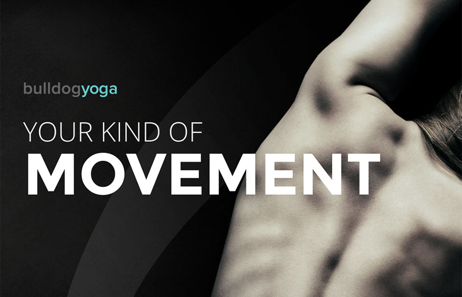
by Aaron Griswold | Apr 4, 2016 | Gallery, Sports/Recreation
I am not going to say something like “a little namaste for your morning”… but I did. We’re big believers in yoga in our family – and most yoga studio sites we’ve seen are… not in line with the rest of their flow. Bulldog Yoga,...
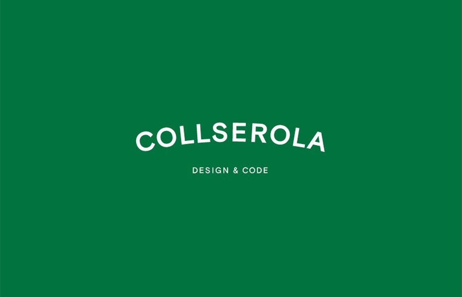
by Gene Crawford | Mar 31, 2016 | Gallery
It’s a simple formula, the design for the Collserola site. Nice fade in interactions and a solid simple grid make this design rock solid IMHO. I’m not wild about the splash area but since the overall production is simple and straight forward it works out....
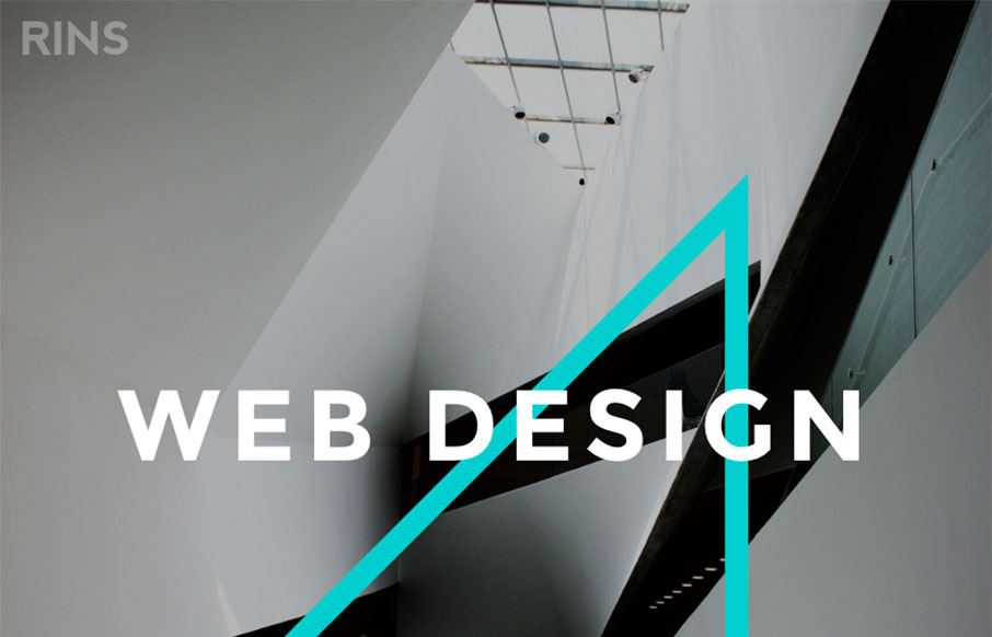
by Gene Crawford | Mar 31, 2016 | Gallery
Amazingly simple website layout with some pretty solid simple design work. I love the photos and the interactions on the letters, it draws you in and makes the simplicity work. From the Designer: We don’t just create beautiful designs but also functional and...
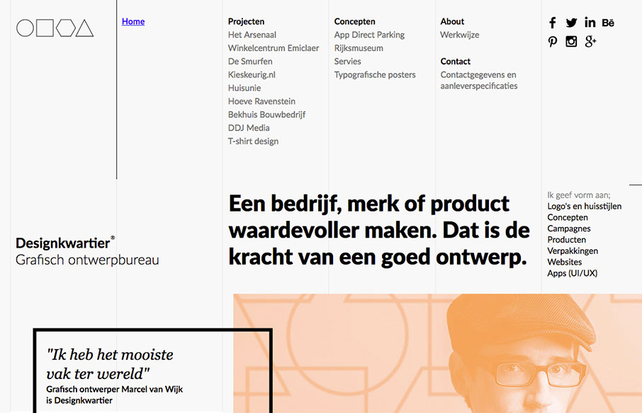
by Gene Crawford | Mar 30, 2016 | Design Firm, Gallery
Super strong grid based design. The layout and details feel very scandanavian to me. I love it so much. It’s not responsive, which is a shame but I still love it. From the Designer: Graphic design agency Designkwartier aka Marcel van Wijk one-man-designstudio...

by Gene Crawford | Mar 30, 2016 | Design Firm, Gallery
Really cool full width layout with a strong grid based. It’s made up of largely squares and the grid, it really is a strong layout, it feels kind of “traditional” to me but the type and colors make it look really futuristic. Real solid design here....