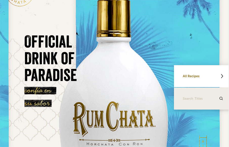
by Gene Crawford | May 18, 2016 | Food and Beverage, Gallery
Some really crazy parallax and interactions on the Rumchata website to get you going.
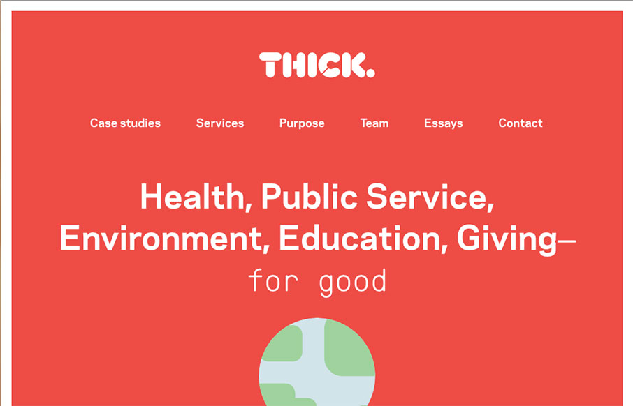
by Gene Crawford | May 18, 2016 | Design Firm, Gallery
Nice structured design. I dig the density of content to design as you make your way down the pagescroll. Solid colors and solid visual brand too. Check the globe on the main hero area as you scroll. Subtle but cool.
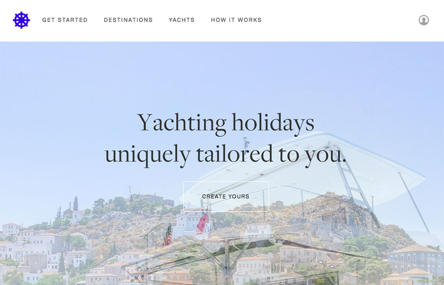
by Gene Crawford | May 17, 2016 | Gallery, Travel
I like how this design feels very open. The interactive parts are sort of placed on top of the imagery to make it feel like it’s floating there. There is also a play between the back and forward arrows and the entire, oversized, image changing out too. Cool...

by Gene Crawford | May 17, 2016 | Design Firm, Gallery
What a badass website. It’s really the approach to the brand that drives this site design. From the animated background flag to each illustration and placement of content this website makes me happy. Bravo.
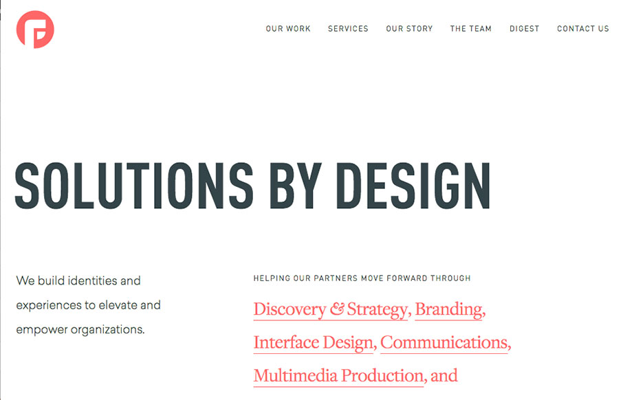
by Aaron Griswold | May 17, 2016 | Design Firm, Gallery
Solid and clean site from Focus Lab out of Savannah, Georgia (just a hop and a skip from us). While I love the whole site – on thing that’s really smart is the video links throughout the site – they are subtle, but pretty effective.