
by Gene Crawford | May 18, 2012 | Gallery
A one-pager with loads of subtle texture and a gentle worn vintage look. The landing page utilizes HTML5/CSS3 and a bit of javascript to engage users and showcase the interface design work. Really wonderful design, with some super nice details. I love the fixed header...

by Gene Crawford | May 17, 2012 | Gallery
Submitted by: Dan Spencer @demicreative Role: Designer & Developer I love this clean crisp layout. The “slide into” fixed header is a nice little interaction and surprise. It’s moments like that when you fall head over heals for a site design...
by Gene Crawford | May 16, 2012 | Gallery
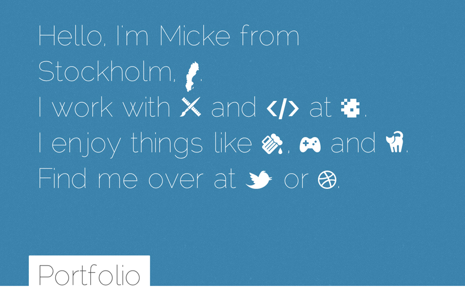
Really smart simple clean design. Love the color transformations with the background and footer area. Responsive layout too FTW.
by Gene Crawford | May 15, 2012 | Gallery
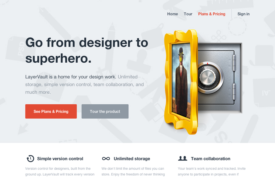
Lovely little site for the brand new version control product for designers, LayerVault: layervault.com (nice work @kellysutton et al)— Daniel Burka (@dburka) April 24, 2012 Really clean and simple layout with some great additions like the rotating background on...

by Gene Crawford | May 14, 2012 | Conference, Gallery
The Go Beyond Pixels website is clean and minimalist, yet it’s beautifully designed with excellent elements throughout the site. The site uses customs fonts which make it that much more unique. The use of icons and clear copy makes it a site that you want to...
