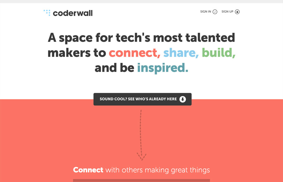
by Gene Crawford | Aug 9, 2012 | Gallery
The coderwall website is a pretty simple, single page website. I really dig it because of this simplicity. It does what it needs to do fast, it uses other people in the industry that you already know to show you who’s using it as well as grouping with other...

by Gene Crawford | Aug 7, 2012 | Gallery, Marketing
It’s cool to see such great design things coming out of Facebook. Is this what they’ve hired all those designers for? Could be, but I really like it! This design is rather minimal which is perfect for this scenario, the grid is also nice how it goes from...

by Gene Crawford | Jul 31, 2012 | Gallery
I really like the way the layout of the homepage for designbyfront.com has been executed. The “badges” on the far right of the page are placed well and somehow don’t get missed like banner ads would. Then there’s the general layout of the...

by Gene Crawford | Jul 26, 2012 | Gallery
So what else would you expect from a website about crafting type than a superbly typeset website. Everything about the type and layout of this website is just perfect. From the vertical rhythm to the letter spacing *shudder* I loves it!

by Gene Crawford | Jul 23, 2012 | Gallery
God I love this website. It’s so full of sweet little details and then awesome features like ‘method’ page. The project planner form is a real piece of work too, I love interactions in the multiple choice section and the price range slider. Spend...
