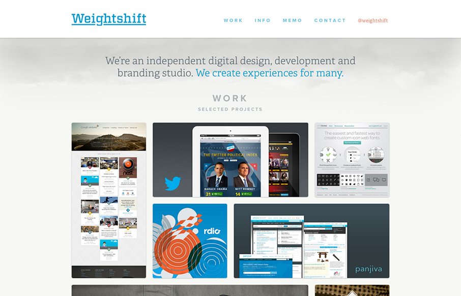
by Gene Crawford | Nov 13, 2012 | Gallery
Superb responsive design decisions made on this newest version of Weightshift’s site. Making the portfolio images get smaller and more button like for the iPad and iPhone screen widths is brilliant. I also think the focus on the selective nav elements as you get...
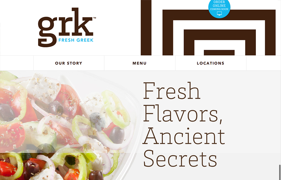
by Gene Crawford | Nov 7, 2012 | Food and Beverage, Gallery
Nice clean and responsive restaurant website. I love this trend of making restaurant websites responsive, give me more please! Overall nice presentation of the food and menu make this website attractive and highly usable. Bravo.
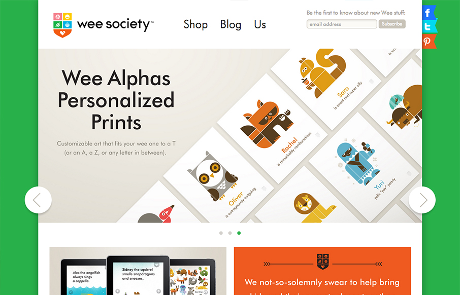
by Gene Crawford | Nov 6, 2012 | Gallery
Super fun looking design/illustration work here. Every now and then there’s just a fun website and this is one of those. Love the animal cartoon work and the website is just about perfect as far as matching the vibe. Love it!

by Gene Crawford | Nov 1, 2012 | Gallery
Lovely home page design. With the split/slide in animation of the creative tools as you slide down the page the site immediately feels activated. I think that’s the point given the subject matter and way the FieldTrip conference is supposed to play out. Just...
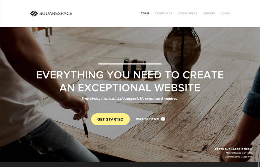
by Gene Crawford | Oct 30, 2012 | Blog, Gallery
The Squarespace product website is simply a thing of beauty. Richly designed and executed with system screenshots and great photography. It’s a long page that scrolls forever but it’s full of useful product info and tells the narrative of using Squarespace...