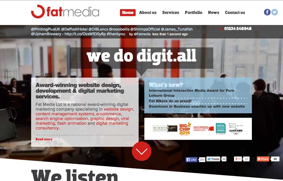
by Aaron Griswold | Jul 29, 2014 | Design Firm, Gallery
Definitely like how Fat Media is doing the foreground / background imaging with a different slant (figuratively and literally). The scrolling animation seems pretty seamless on the home page – and like the hover state of the staff on the home page too. Submitted...
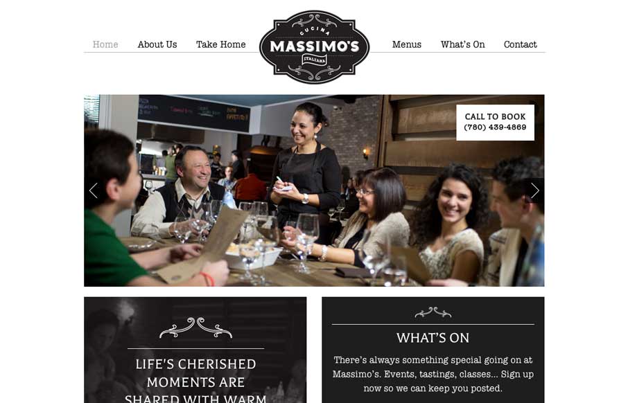
by Gene Crawford | Jul 29, 2014 | Food and Beverage, Gallery
We love websites that make great use of fonts, and Massimo’s Cucina Italiana uses a couple of different fonts, accent illustrations, vibrant pictures, and black, white, and gray to tell the story of their restaurant. Simple, and effective. Submitted by: Landon...
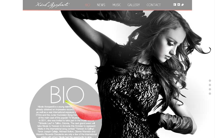
by Aaron Griswold | Jul 29, 2014 | Entertainment, Gallery
Great use of parallax with flying flower petals, bios, and a singer. Also like the use of texture in one of the sections, and then subtler parallax in another section to give some differentiation. Submitted by: Justin Sammut Role: Designer
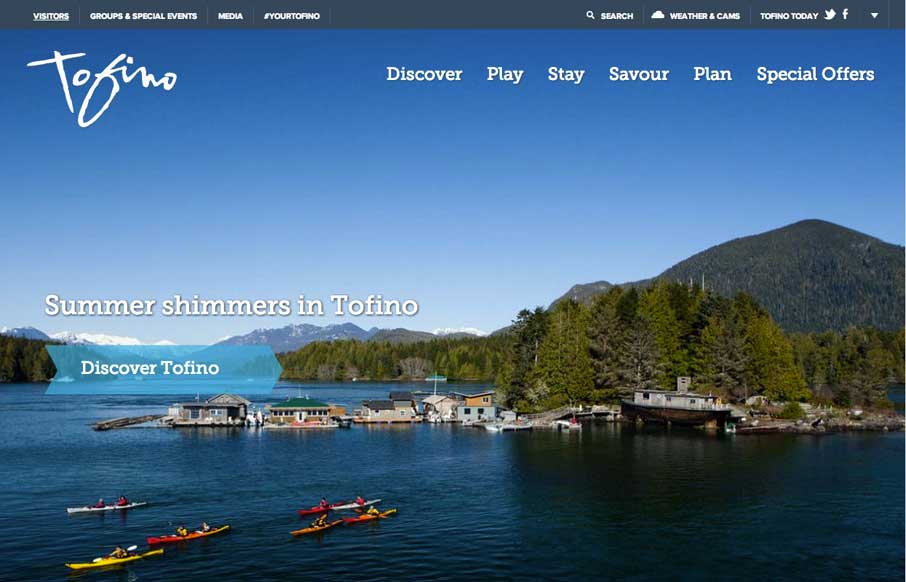
by Aaron Griswold | Jul 28, 2014 | Gallery, Travel
Cool use of different elements and shapes to give clear section delineations on the home / single page design. Also like the only drop-down in the top right corner (arrow) that works as a dashboard for the site. Submitted by: Jim Morris @ventureweb Role:...
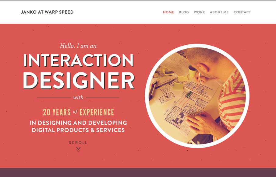
by Aaron Griswold | Jul 28, 2014 | Gallery
Hallo Janko! You probably know we see a lot of portfolio sites from graphic and web designers, but not as much from interaction / dashboard designers and developers (if that is a separate category). Janko’s site has a cool feel to it, and in the Works area, you...