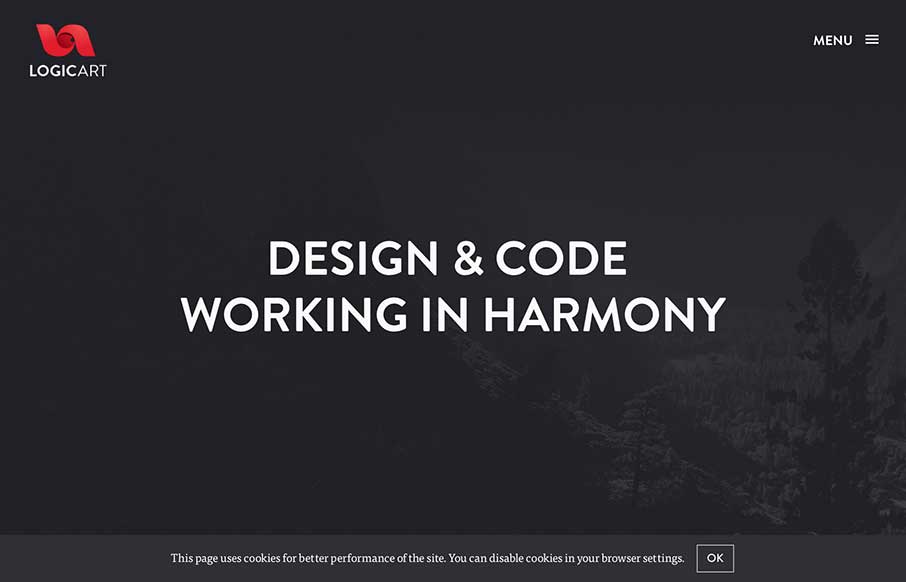
by Aaron Griswold | Oct 8, 2014 | Gallery
I really like how this site flows. The scrolling of the subtle parallax and the reveals is very smooth. The muting of colors helps accent the portfolio and the designers themselves. Submitted by: Monika Majkowska @logicartpl Role: Designer Logicart is a small creative...
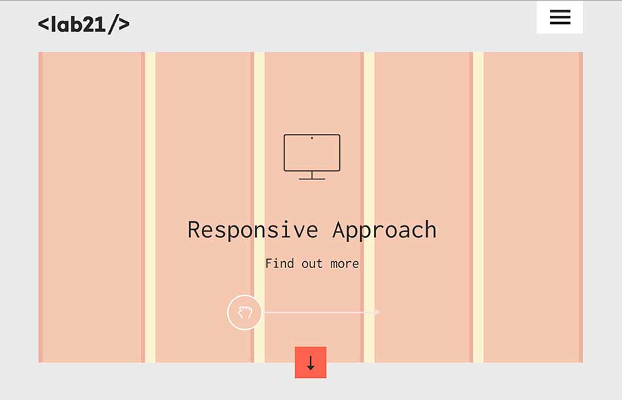
by Gene Crawford | Oct 7, 2014 | Gallery
There is really a lot going on with this site to love. I really dig how it’s educational as well as neat looking. With the ‘responsive approach’ thing up in the hero area they are using it to describe to potential clients exactly what they’re...
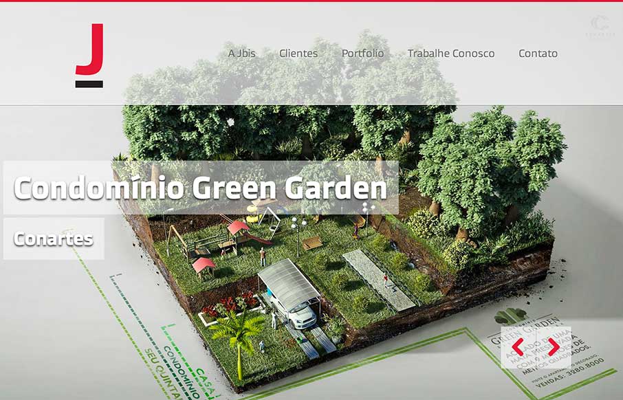
by Aaron Griswold | Oct 7, 2014 | Design Firm, Gallery, Marketing Company
The vibrant images in the slider really help to sell the rest of the one page site. The interaction of the form fields are pretty cool too. Submitted by: ORO Digital Role: Designer & Developer

by Aaron Griswold | Oct 7, 2014 | Gallery
“Live Free or Dang (and Blast)” – ok, living in New Hampshire for six years, I saw a joke there… just sorry it was a bad joke… But Dang and Blast’s agency site is neither of those. It’s a good, clean site that is modern,...
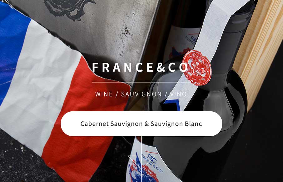
by Gene Crawford | Oct 6, 2014 | Food and Beverage, Gallery
Looks like a simple site – but some nice background image, slight parallax feel in the scroll. A little confused on the copy translation and repeats, and the social icons that go nowhere. But the design itself is vibrant, and seems to get the brand’s image...