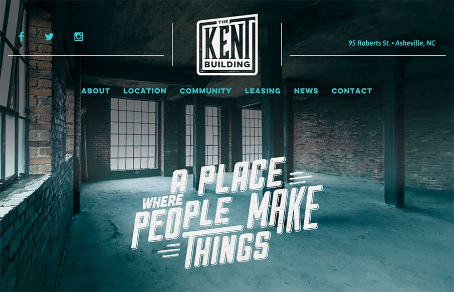
by Aaron Griswold | Oct 22, 2015 | Gallery
Excellent site from Open Door Design Studio out of Asheville for The Kent Building. Yes, normally I would say – “compared to other real estate sites…” – but we’ve seen really good growth in the real estate niche of awesome looking...
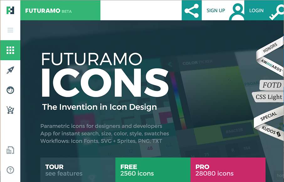
by Aaron Griswold | Oct 22, 2015 | Gallery
Love the look of this site from Futuramo Apps out of Poland. Check out the Tour and Team pages – great use of movement and a totally different look than what we’re used too from “app” product pages. From the Designer: Parametric icons for...

by Aaron Griswold | Oct 21, 2015 | Gallery, Portfolio
Love this site from Will Fernandes out of São Paulo, Brazil. I know that on the face of it, the site is mostly images – but everything is laid out cleanly to let the art be the center piece – great imagery! From the Designer: I am Will Fernandes, a...

by Aaron Griswold | Oct 21, 2015 | Gallery
Good, clean site from Indigo Kids out of Lithuania. One quick think I really like is the color change of some of the elements as you scroll down the interior pages – it’s subtle, but a nice touch. From the Designer: Great businesses are built on great...
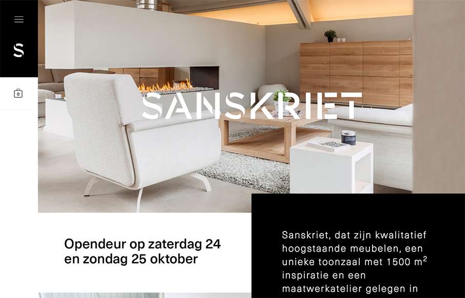
by Aaron Griswold | Oct 21, 2015 | Gallery, Product
Great looking block design site by Skinn for Sanskriet Furniture in Belgium. Great photography always helps, and the layout is pretty cool too. From the Designer: Design wooden furniture Submitted by: Siebe Jacxsens Twitter: @skinn_be Role: Designer & Developer...