
by Gene Crawford | Feb 10, 2016 | Gallery
Some real nice interactions worked into the Surfy website. I love how the main navbar isn’t visible until you scroll a bit, then sticks. Then you’re presented with a stack of work samples with a slight zoom effect when you mouse over each one. Clever and...
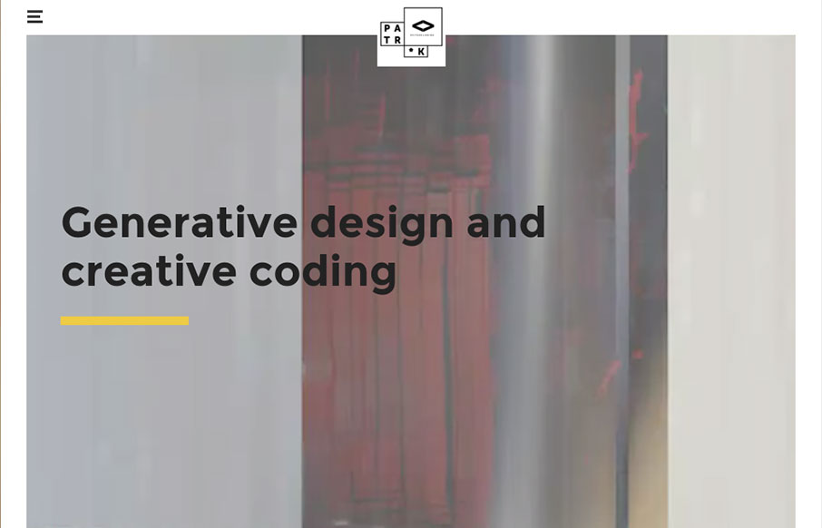
by Gene Crawford | Feb 10, 2016 | Gallery, Portfolio
It’s not often that I see a submission and think “badass”, this is one of those exceptions. I really dig this portfolio site for Patrik Huebner. The grid, the minimal approach layered over with kick ass graphics and then the little details instilled...

by Aaron Griswold | Feb 9, 2016 | Gallery
Love the movement and design of this site for Mikiya Kobayashi out of Tokyo. Kobayashi’s design work is beautiful, and the site really shows all of it off well. I don’t always like the double off-screen / hamburger nav, but they only use it for the...

by Gene Crawford | Feb 9, 2016 | Fashion, Gallery
Nice flat areas for the make up of this layout. They have a masonry type effect on them as well as you resize the browser. Clever. I love the way the images are different sizes and stuff as you scroll down too, keeps it feeling dynamic. From the Designer:...
by Gene Crawford | Feb 9, 2016 | Education, Gallery
First and foremost this resource is incredible. Brilliant. Secondly it’s a great example of material design in practice. Very clear interactions and super easy ways to get into the content and have the site itself disappear well enough to let it all come...