by Gene Crawford | Jun 19, 2017 | Gallery
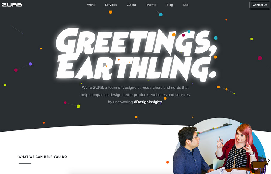
Via Zurb: We’ve rebuilt ZURB.com. I know, I know… we’re living in the year 2017, and it’s customary for companies to redesign their website every few years. That’s about exciting as letting you know we paid our electric bill this month. But this is different....

by Gene Crawford | May 19, 2017 | Gallery
Pretty slick visual design. I love the light vibe to the colors/contrast and typography work. I have to say the interstitials kind of get annoying after a while, but I get why they’re there. All in all this is a beautifully designed website.
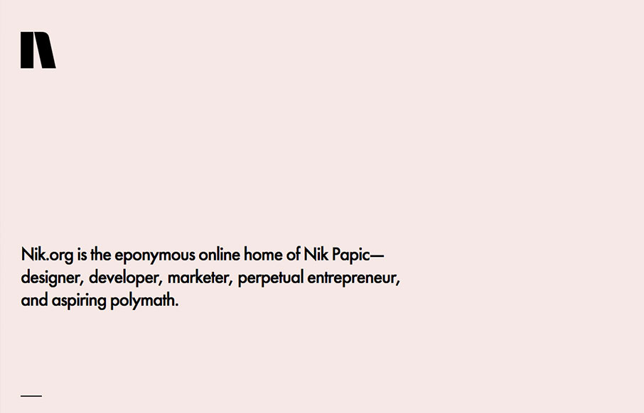
by Gene Crawford | May 18, 2017 | Gallery, Portfolio
Lovely and simplified single page resume/portfolio website. I love the background color and the black/white palette. Nice grid work and layout too.

by Gene Crawford | May 17, 2017 | Gallery, Portfolio
Very cool, beautiful and simple approach to Clement SIMON’s portfolio. I love the way you scroll this and the imagery is timed visually just right. Beautiful little visual details too. From the Designer: Hi, I’m Clement SIMON, a 23 year old graphic...

by Gene Crawford | May 16, 2017 | Gallery
Love the new(ish) Viget site design. The simple grid and the beautiful typography and photography really bring the focus to the content. These guys are top-notch in the industry, go check the website out in detail and learn what you can.