by Gene Crawford | Oct 15, 2012 | Blog, Gallery
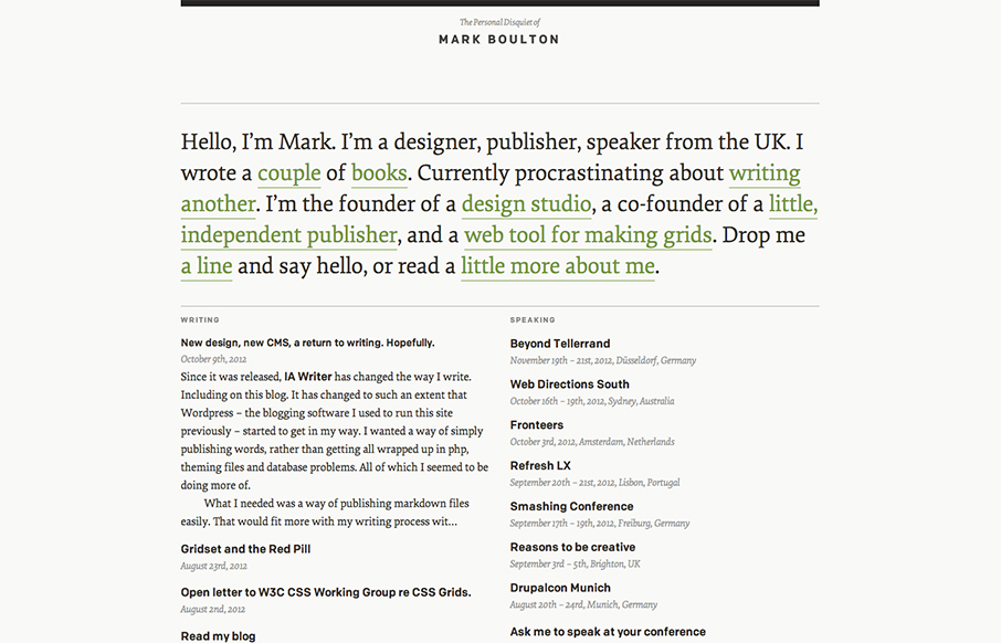
I’ve watched Mark Boulton’s blog/site designs over the years make this really refreshing trip towards being completely minimal. I love it. He’s gotten down the just the bare essence of what he needs in a website, particularly with this latest design...
by Gene Crawford | Oct 10, 2012 | Gallery
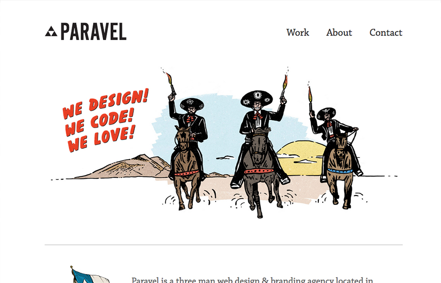
New update for the Paravel team’s website. They’ve simplified what was there before and boiled it all down to just what’s needed to communicate what it is they do and have done. Telling their story quickly with a super badass illustration. The thing...
by Gene Crawford | Oct 3, 2012 | Gallery
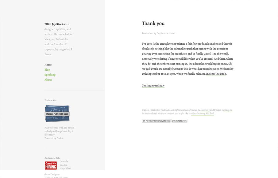
Minimal design approach on Elliot Jay Stocks website redesign. I like the intellectual approach to keeping the design focused around the content. In his post on the redesign Elliot says: When we focus on measure, we are of course focussing on the pleasure of the...
by Maria | Oct 1, 2012 | Gallery
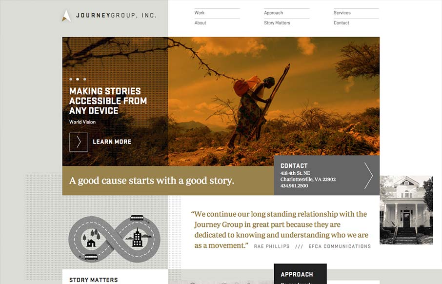
Order yet disorder. That’s how I like to think about this design. It starts off with this really strong grid feel and then the shapes and blocks of copy/images start to feel really asymmetrical and wonderful. I like the blocky vibe with the type and the flat...
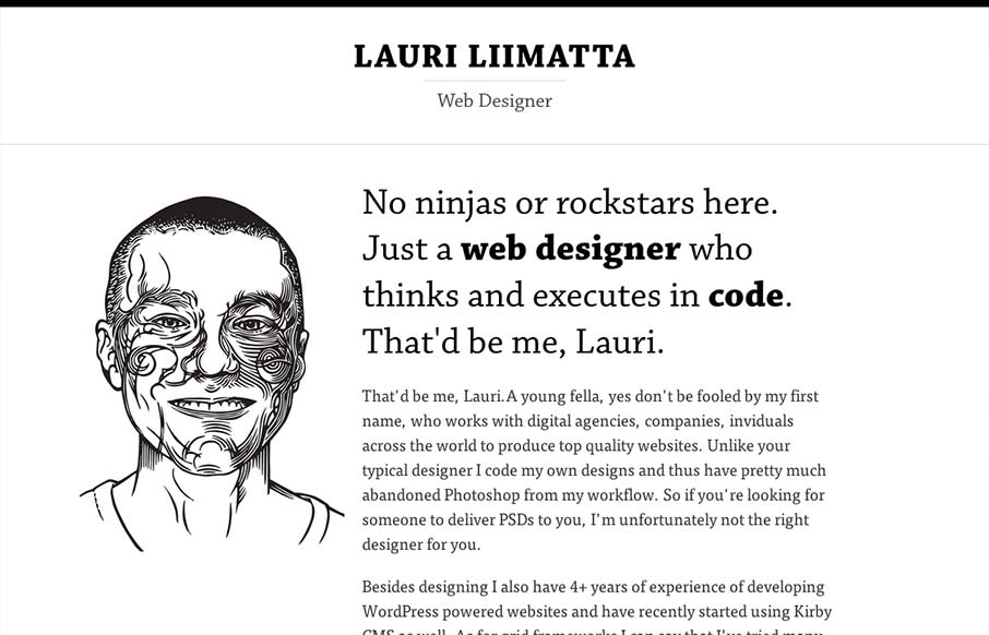
by Gene Crawford | Sep 26, 2012 | Gallery
Submitted by: Lauri Liimatta @laurilii Role: Designer & Developer My new redesigned portfolio. Responsive design and powered by Kirby CMS. I like the design approach of going light to dark from top to bottom, or light to dense visually. However you want to look...
