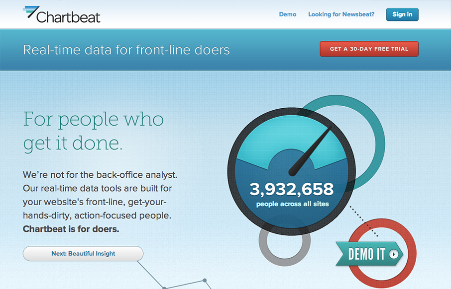
by Gene Crawford | Dec 13, 2012 | Gallery
I really love this narrative as you scroll home page for Chartbeat. It just sings to me. You can essentially get acclimated to what the product does for you as you make your way through the page. It’s also superbly executed. It’s exciting visually. This is...

by Gene Crawford | Dec 12, 2012 | Gallery
Nice clean and sleek looking new design for the Skype website. It’s responsive too which is super smart for them to not miss this type of user since Skype is not available on most mobile platforms. I love the big call to action in green almost in the center of...
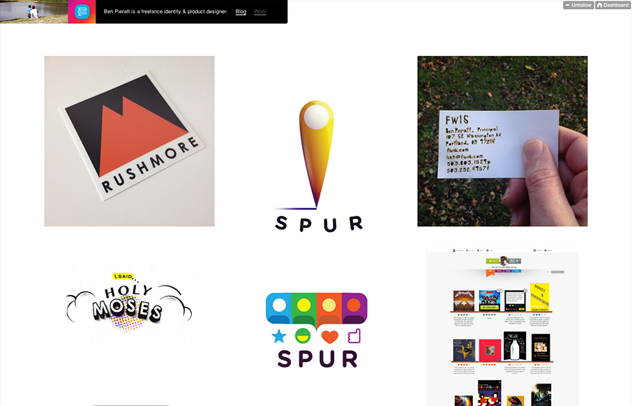
by Gene Crawford | Dec 12, 2012 | Gallery, Portfolio
Poring over @pieratt’s new site. Lots of beautiful and thoughtful work here: dmall.me/Udbqtz— Dan Mall (@danielmall) December 4, 2012 Super simple and minimal design for Ben Pieratt’s portfolio website. It’s a Tumblr site too, I always love it...
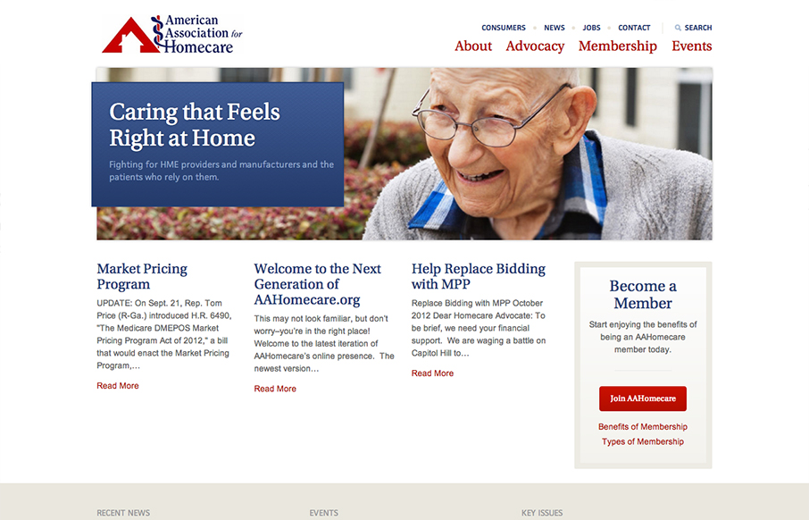
by Gene Crawford | Dec 11, 2012 | Gallery, Nonprofit
I like the changes in the way the main nav and “tools” nav are handled in the transition between screen widths. Nice simple clean design makes it easy to get in and out of the content.
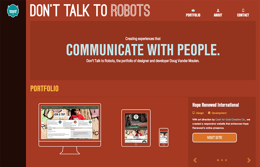
by Gene Crawford | Dec 10, 2012 | Gallery, Portfolio, Screencast Review
Submitted by: Doug Vander Meulen @dt2r Role: Designer & Devleoper Don’t Talk to Robots is the portfolio of designer and developer Doug Vander Meulen. The responsive design highlights various web design and print projects via re-sizable slideshows. The site...