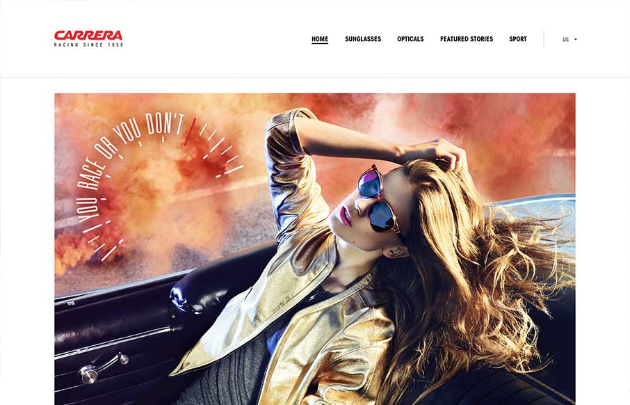
by Giovanni DiFeterici | Jun 18, 2013 | Gallery, Shopping
I really like how carreraworld has broken the grid. The site is well structured, but has loosened the hard lines of the grid it uses to create a more free flowing and energetic design. Nothing feels static. Even thought the design is wildly varies throughout the...
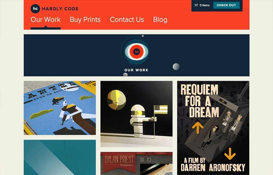
by Gene Crawford | Jun 13, 2013 | Gallery
I love a simple layout that just works. In the case of Hardly Code, they sell stuff that looks awesome. They show you stuff that looks awesome and get the hell out of the way. Bravo.

by Giovanni DiFeterici | Jun 11, 2013 | Gallery
Mengto is a study is awesome transitions. The work is clearly beautiful and conceptual. I love the texture and open design. Designers often talk about creating ‘delight’. The animations that slide every element into place upon page load creates that for...
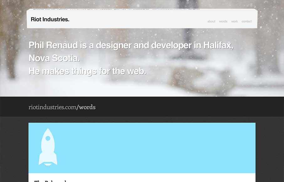
by Gene Crawford | Jun 11, 2013 | Gallery
Some really nice fun subtle design stuff in the header of this site: riotindustries.com— Chris Coyier (@chriscoyier) June 4, 2013 I couldn’t agree more with Chris. The header is a beautiful example of adding a dimension of animation/interactivity and not...

by Gene Crawford | Jun 5, 2013 | Gallery
Nice clean design. I like the hard angles across this design mixed with the cool colors that make it up. This layout feels very high end which is clearly the character this company is trying to portray – they nailed it.