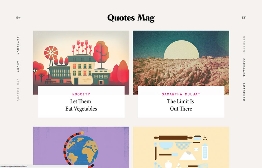
by Aaron Griswold | Feb 15, 2016 | Blog, Gallery
Good looking, minimalist blog site out of Bulgaria for Quotes mag – a project of Next-DC. Great card design, cool flat illustrations for blog post headings, and love the typography. Here’s a little more about it: “Quotes Magazine is a collection of...
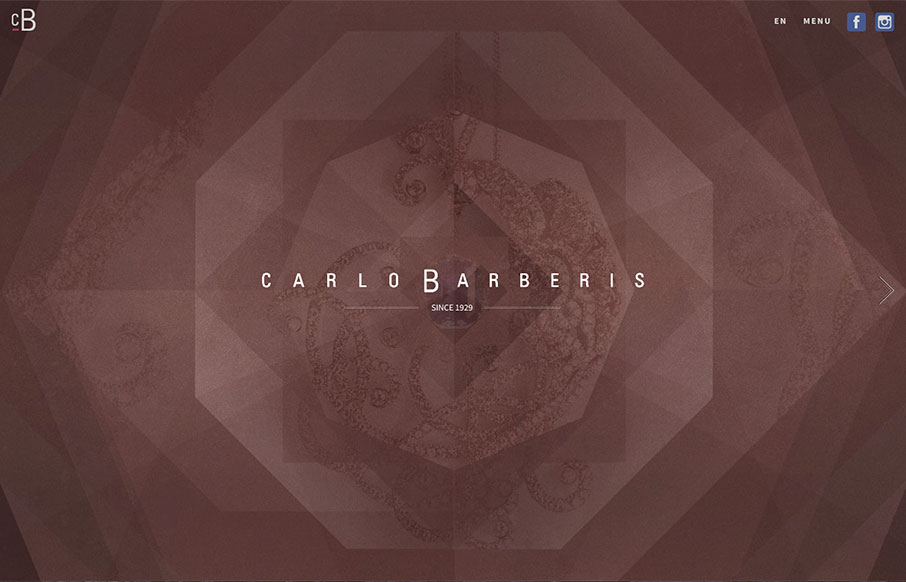
by Aaron Griswold | Feb 15, 2016 | Fashion, Gallery
This is a great showcase site for Carlo Barberis’ jewelry collection, out of Italy. Love how the home page is just a scroll slider, but before you start, the changing of the overlaying patterns already give movement and life to the page. Also think the...
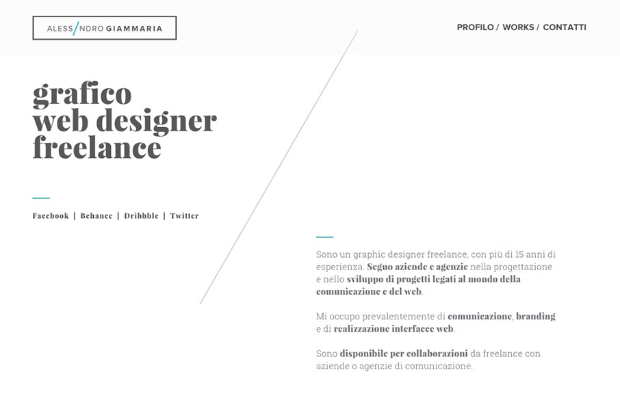
by Gene Crawford | Feb 11, 2016 | Gallery, Portfolio
Beautiful grid based design, you can feel it as you review it. The diagonal lines really drive home the grid and balance your eye movement beautifully. Love this site. From the Designer: I want to submit my new portfolio web site. I work hard to design this new...

by Gene Crawford | Feb 10, 2016 | Gallery
Pretty neat approach with the 8th Sphere website. No real images of anything, just line graphics and a dark background with white text. You don’t see that often anymore. I dig this approach. I like the main graphic a great deal, the process/machine one. Pretty...

by Gene Crawford | Feb 10, 2016 | Gallery
Some real nice interactions worked into the Surfy website. I love how the main navbar isn’t visible until you scroll a bit, then sticks. Then you’re presented with a stack of work samples with a slight zoom effect when you mouse over each one. Clever and...