by Gene Crawford | Apr 10, 2012 | Gallery, Screencast Review
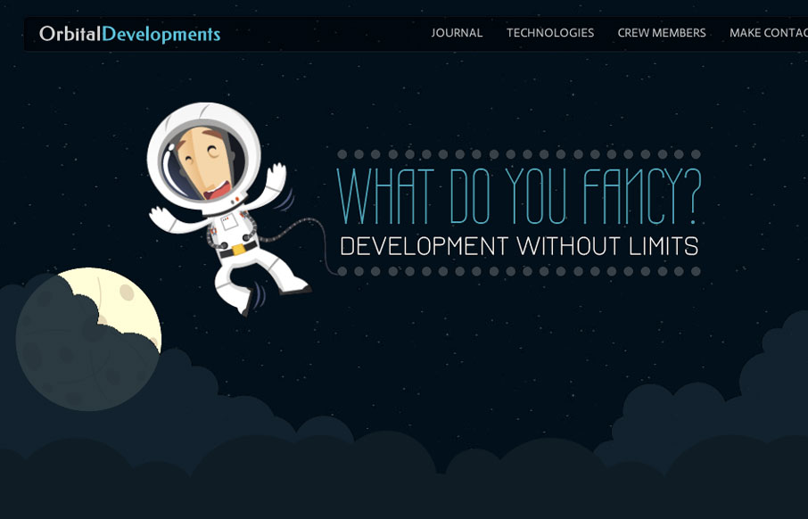
Love the Orbital Developments site design. It’s fun and functional. I really dig the responsive approach and some of the finer details. Like the moon and slight astronaut animation. Gio and I dig in with our screen cast review, give it a watch and tell us what...
by Gene Crawford | Apr 4, 2012 | Design Firm, Gallery
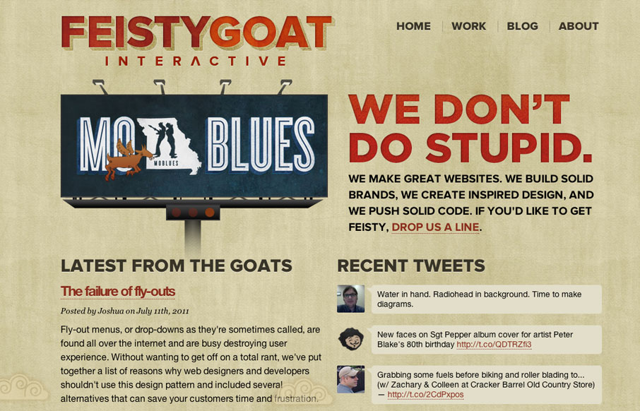
I love the bold two column layout of the Feisty Goat website. The animations are fun and the overall tone is indeed feisty. I really like that they have thought out their brand’s tone so fully and push it with the copy and everything. In this case it really...
by Gene Crawford | Mar 28, 2012 | Gallery
Very tight design. I like the animated background image around the logo/illustration. I particularly like the effectiveness of the footer area/contact form. The experience of going from page to page and getting the slide down effect is pretty cool, but gets a bit...
by Gene Crawford | Feb 7, 2012 | Gallery
I love this design, the animation in the header is mesmerizing, in a good way I think. Super awesome lineup, Bill Clinton? I just love the illustrations of NYC and how it’s echoed from the header to the footer but night at the bottom. Slick.
by Gene Crawford | Dec 22, 2011 | Gallery, Sports/Recreation
Another great website design for nike stuff. Has pretty strong notes from the Better World site design, that is to say it has that vertical parallax thing. Overall it’s quite nice and I really like the rhythm it strikes as you scroll down the page. The...