
by Gene Crawford | Feb 17, 2014 | Gallery
What a great experience the Trippeo website is. It is succinctly designed but rich visually. The timed animations that fire off as you scroll down the page are great and there is no real “scroll hijacking” to speak of. The signup page is super well...
by Gene Crawford | Feb 11, 2014 | Gallery
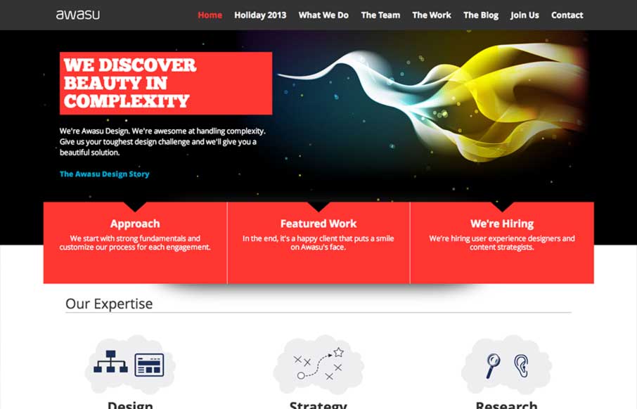
A really great graphically rich design that isn’t overkill visually. There is a clear focus on intent, they work really hard to focus you where they want you to go and there’s not a lot of excess noise to distract you from that path. I like the...
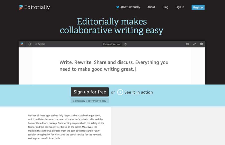
by Gene Crawford | Feb 4, 2014 | Gallery
This may not sound like the smartest review; but I love websites that are mostly words and wind up feeling like they are graphically rich. The Editorially site does just that. It’s a website selling and app that’s built for writing where all the crud of a...

by Gene Crawford | Jan 9, 2014 | Design Firm, Gallery
The Drexler website is both minimal and highly interactive. There’s plenty of javascript here for everyone but it’s not overly distracting. Things move around smoothly and it’s still fairly easy to generate a good mental picture of what’s going...
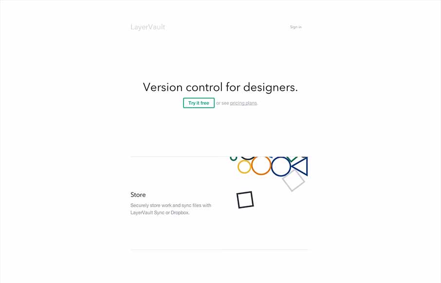
by Giovanni DiFeterici | Dec 16, 2013 | Gallery
Layervault has some crazy awesome animations. I love how each of the animations intuitively relates to the idea that they are trying to convey. It’s visually minimal, but conceptually complex. So simple and so effective. Nicely done.