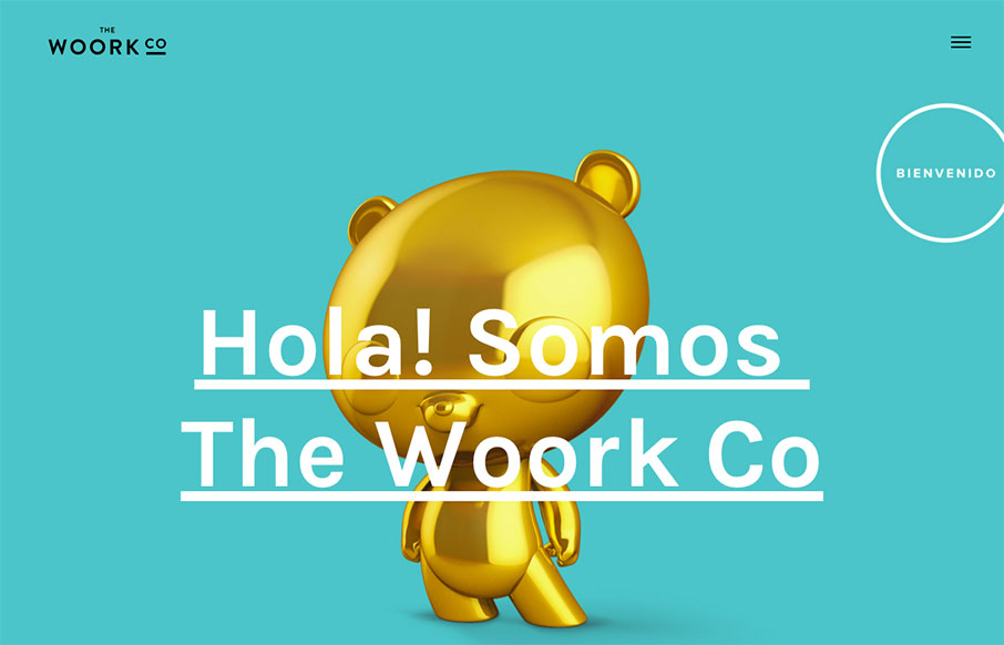
by Aaron Griswold | Feb 22, 2016 | Gallery
Bienvenido to your Monday – here’s a quick site out of Madrid from The Woork Co. I like the little surprise of the animated gifs in the block design as links to their work. The whole site is very clean and crisp and solid. From the Designer: Madrid based...

by Aaron Griswold | Feb 18, 2016 | Gallery
Good full-width agency work from Taikonauten out of Berlin. I like how they make the device images complement the page coloring – and show the devices in different views and states – smart for agency / portfolio work.
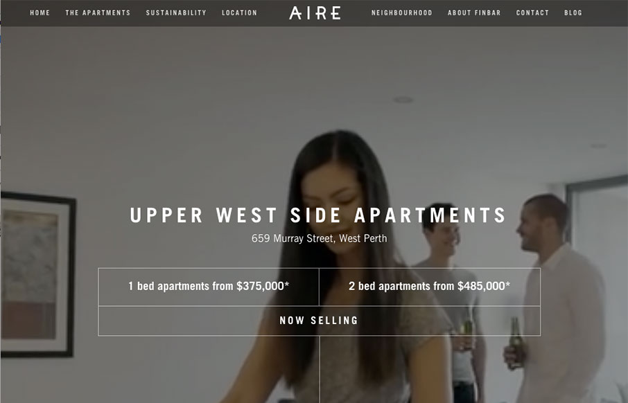
by Aaron Griswold | Feb 18, 2016 | Gallery, Real Estate
Dang – that’s a cool website for Aire West Perth – an apartment building sales site out of Australia. Great video background work – and then about everything you would need to get you to come and visit in person. I mean hey – it made me...

by Aaron Griswold | Feb 17, 2016 | Gallery
Maybe it’s the engaging, parallax images on the home page – maybe it’s just Piper Perabo – but I’m really drawn into the Chargefield site (out of Ontario). Crisp work all the way through – very cool. Submitted by: John Godfrey...

by Gene Crawford | Feb 10, 2016 | Gallery
Pretty neat approach with the 8th Sphere website. No real images of anything, just line graphics and a dark background with white text. You don’t see that often anymore. I dig this approach. I like the main graphic a great deal, the process/machine one. Pretty...