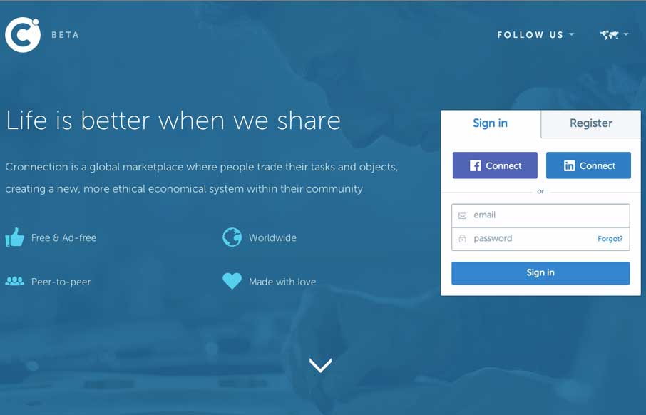
by Gene Crawford | Oct 15, 2014 | Gallery
I love a lot of the detail work in the different visual sections of this site. The way things are stacked and lined up is pretty tight and while very similar to other website’s feels a little different somehow. Submitted by: Álvaro Castaño @cronnection Role:...
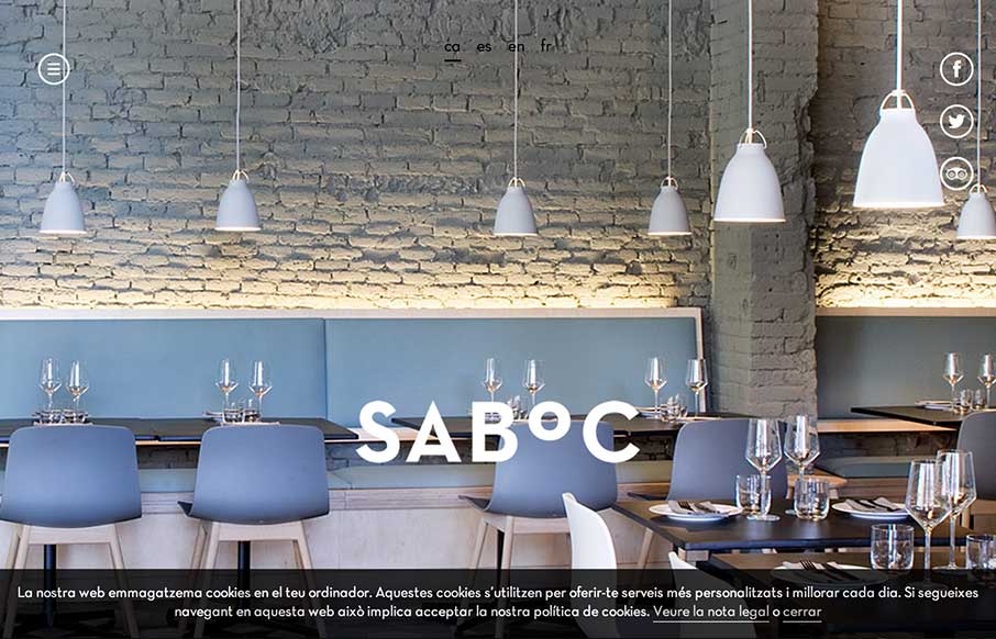
by Gene Crawford | Oct 10, 2014 | Food and Beverage, Gallery
Cool site design. I like the vibe of this single pager. The hamburger icon is in play here, but it’s really just for anchors along the page. Nice use of that in this instance IMHO.

by Gene Crawford | Oct 3, 2014 | Entertainment, Gallery
Pretty cool to see a page for a campaign, something that’s part of something larger and possibly offline to boot. Good stuff. This site is wild and has all sorts of stuff going on but at the same time it’s easy enough to get into. Submitted by: Raul Ortiz...

by Gene Crawford | Oct 2, 2014 | Gallery
I like a lot about this website. It’s simple, single page, minimal color palette. But it communicates what they do and has some bells and whistles to show off to potential clients. Submitted by: Pedro Thomaz @PTthe13 Role: Designer Clean and modern single page...
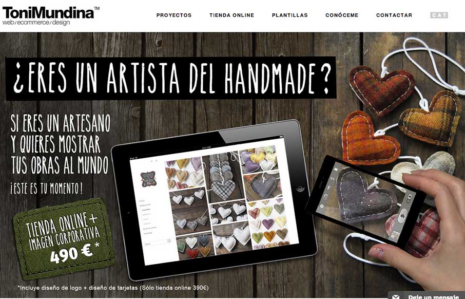
by Gene Crawford | Sep 26, 2014 | Gallery, Portfolio
It’s a standard clean style layout that has good responsive adaptations applied to the design. What I like most is the work put into the imagery, it takes time to get stuff like that to show off in a way that’s compelling. Submitted by: Toni Mundina Role:...