Login forms often get overlooked when you’re designing for your website or web app, they can be a big part of your branding or depending on things you integrate could get in the way and even hamper community conversation. In this episode of the unmatchedstyle podcast we investigate the strategic use of the login form and also talk with Ron Lewis, Creative Director at Mailchimp about their super neat login page designs.
Login Forms
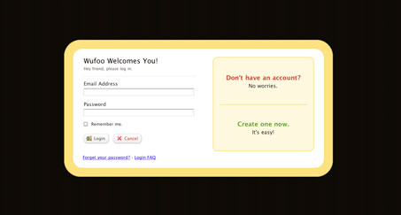
There is actually a lot that goes into the design of the login form page. Take the one on Wufoo.com for example. They have devised almost the perfect login form page:
The page is whittled down to only the form it’self, plus a couple of really helpful related links. Effectively eliminating any errors of the user clicking away from the page. The form is simple and has all useful relational links and info bunched together inside what looks like a focused modal window type box.
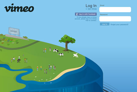
Vimeo has a really great looking login page too. They’ve done very similar things to Wufoo in that they’ve eliminated any extra links and distractions. But they’ve gone one further and made the page itself very fun and engaging visually. Almost making the login page itself a destination.
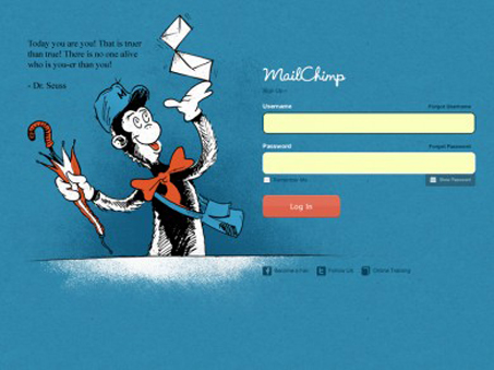
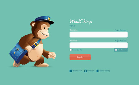
Mailchimp also employs this same tactic on it’s login page, but they change it every so often to help create buzz around their service. Like recently where they celebrated Dr. Seuss’ birthday by working in art that has that classic look and feel to the illustration next to the login form itself. (check out their Flickr gallery of their past login form page designs.)
Interview: Ron Lewis
At this point it’s fairly well known that Mailchimp builds in lots of personality into their application, their mascot is s chimp for crying out loud. It’s fun and quirky and helps build a lot of good will between the service and it’s users because of that friendliness. Ron Lewis, Creative Director at Mailchimp shares some insight into how the design team there works on the login page designs specifically.
They utilize the login page as one of the places where they can deliver on their brand and have changes to art on the page that align with holidays or important dates in history. It’s super fun when they roll one out and often it’s only for a short time, effectively creating traffic to the page of people who just want to see it. It’s a team approach to coming up with ideas Ron says, he let’s the talented design crew have at it or sometimes he works with an outside illustrator. Like with Freddie (the chimp) himself, which was originally sketched and designed by the company’s owner then later they commissioned John Hicks to give Freddie a new look.
Login & Troll
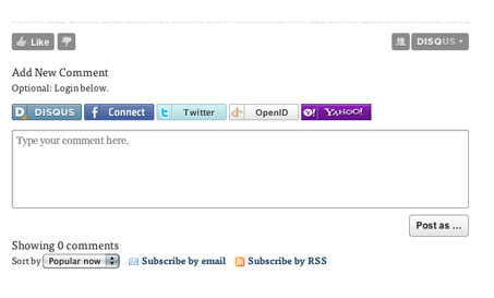
Looking at different use cases and the impact of putting a login form in different places on your website, like before blog comments. Like on disqus enabled comments. The main goal being to link your social network profile(s) with your comments, that’s a powerful combination and can really help engage a community to comment more, or to give better comments.
Then there is TechCrunch, the website has recently changed over to using the facebook comment widget for visitor comments. This would definitely help build the site’s profile within facebook but i’d venture to guess it would also limit the overall amount of comments on this particular website. Maybe that’s the point though, to eliminate anonymity and help squash trolls.

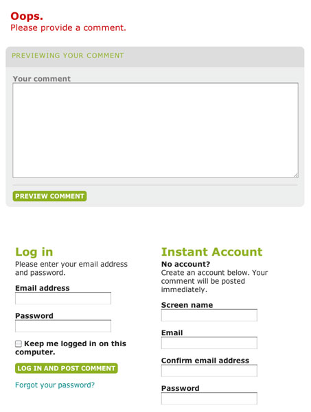
Our last example is the Charleston City Paper’s website. This website has created a process where you need to become a ‘member’ in order to leave a comment. This might not appear to be a big deal, but the user has no idea they are required to do this until after you have entered a comment and clicked the submit button. IMHO that would greatly reduce the ease of use and limit community involvement on the site.
That’s it for Episode 59 of the unmatchedstyle podcast. You can follow us on twitter @unmatchedstyle and on iTunes here.



0 Comments