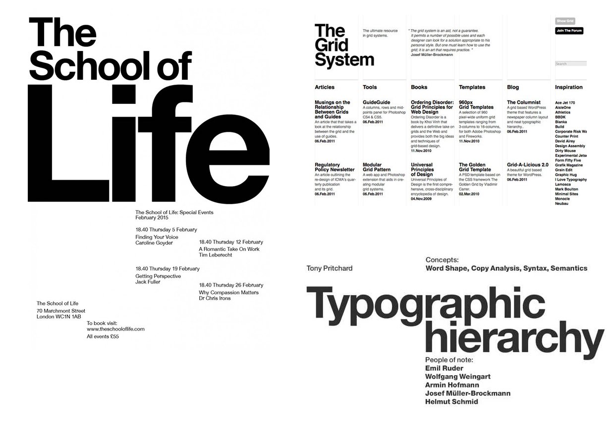
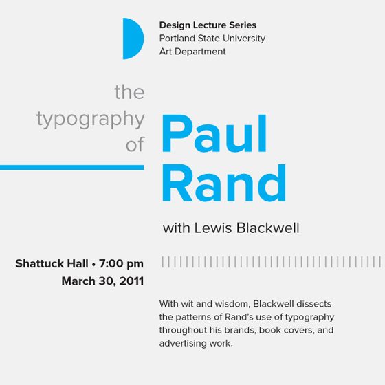
In the vast realm of graphic design, there exists an age-old technique that holds the key to effective communication with viewers and readers alike. This technique is known as “Hierarchy,” and when applied visually or typographically, it becomes an invaluable tool in the hands of skilled graphic designers. Its primary purpose is to organize content and emphasize important elements, ensuring that the page is not only aesthetically pleasing but also highly readable and scannable, even when dealing with copious amounts of information.
Understanding Signals & Cues
At the heart of typographic hierarchy lie simple yet powerful signals and cues that guide the audience through the content with ease. One such signal is the use of line breaks to denote paragraphs, providing natural breaks between different sections. Additionally, designers can harness the potency of bold or italicized text to highlight emphasis and draw the readers’ attention to crucial points.
However, like any art form, restraint is key. It is recommended to use no more than three signals or cues at once, as overdoing it can lead to a cluttered and unappealing design. Imagine the chaos of using bold, italic, and underline simultaneously. The key is to maintain elegance and sophistication in the design solution, leaving a lasting impact on the reader’s mind.

The Approach to Designing with Hierarchy
A well-defined design system is crucial in creating an effective hierarchy. A practical approach begins with setting the body copy size as the foundation. This is because the body copy forms the most substantial portion of the content and sets the tone for the entire layout. Once the body copy size is established, the designer can then scale up the type size for the primary header, usually around 200% of the body copy size. For secondary headers, a scale of 150% works well, and this pattern continues for subsequent levels.
Balancing Aesthetics and Functionality
The beauty of typographic hierarchy lies in its ability to strike a delicate balance between aesthetics and functionality. As designers, we have the power to engage the audience visually while making the content easily digestible. With appropriate font choices and sizing, combined with strategic use of bold and italics, we create a seamless flow of information, enhancing the overall user experience.
Enhancing Readability
Hierarchy plays a pivotal role in enhancing readability, especially in the digital age, where attention spans are shrinking, and the battle for readers’ attention is fiercer than ever. A well-structured hierarchy enables readers to quickly identify where sections start and end, allowing them to navigate through the content effortlessly.
Elevating User Experience through Typographic Hierarchy

In today’s fast-paced world, users crave information that can be absorbed swiftly and efficiently. That’s where typographic hierarchy comes into play, elevating the user experience by making content easily scannable and digestible. Let’s delve deeper into the ways we can utilize this technique to create compelling content that can outshine competitors on Google search results.
1. Crafting Attention-Grabbing Headlines
The first step in winning the SEO game is to create captivating headlines that incorporate relevant keywords. By scaling up the type size for primary headers and using bold formatting, we draw the readers’ eyes towards the most critical information.
2. Breaking Down Content with Subheadings
Subheadings serve as invaluable signposts for readers, guiding them through the different sections of the article. By using a larger font size and a distinct styling, such as italics, for secondary headers, we create a clear visual distinction between sections, improving overall readability.
3. Emphasizing Key Points
Strategic use of bold text allows us to emphasize essential points, ensuring that they don’t go unnoticed. When combined with appropriate font sizing, bold elements stand out, reinforcing the key takeaways for the audience.
4. Establishing Visual Hierarchy in Lists
Lists are a popular choice for presenting information concisely. To optimize their impact, we can utilize typographic hierarchy by using bold formatting for list items and slightly increasing the font size. This draws attention to each point, making it easier for readers to absorb the information.
5. Creating a Seamless Reading Experience
As readers scroll through the content, the hierarchy acts as a gentle guide, leading them from one section to the next effortlessly. By maintaining consistency in font choices, sizes, and formatting throughout the article, we ensure a seamless reading experience.
Further learning on this subject
Typographic Hierarchy from tonypritchard on Vimeo.
Three things every designer needs to know about Typography
https://uxplanet.org/3-ways-to-immediately-improve-the-legibility-of-your-typography-settings-ba22670b1ae1
Typography in Windows Apps
https://learn.microsoft.com/en-us/windows/apps/design/style/typography
Typography Insight App
https://apps.apple.com/us/app/typography-insight/id432722506


0 Comments