Design deliverables can be challenging in a multi-device world. Front-end developers have had their day playing with fluid grids, flexible content, and media queries. Now it’s time to let the rest of the team in on the job.
We investigate how to get design approval in the context of a responsive process. We hope to challenge you to get into our medium earlier in your process, demonstrating the benefits of in-browser design review and “Style Prototypes.” In addition, you’ll learn how these kinds of deliverables can help educate your clients and establish appropriate expectations early in a project. – Ben Callahan
Presented by Ben Callahan at the October 2013 Beyond the Desktop Conference in Nashville, Tennessee.
bdconf.com – @bdconf where he will be speaking again on November 03 – 05, 2014 in Orlando Florida.
About Prototyping Style
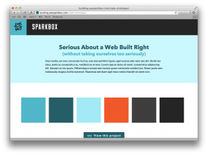
In a nutshell, the goal of a Style Prototype is to allow a client to get a visual summary of a site’s proposed design direction without the time investment of creating multiple pages of Photoshop comps or fully developing HTML pages. You can read more about the genesis of Style Protypes from Sparkbox’s Jeremy Loyd’s original post, and then see how Ben and his team at Sparkbox have expanded on that to build a more comprehensive process around Style Prototypes in his post on Dissecting Design.
Also – see the example of Sparkbox’s Style Prototype in action at: building.seesparkbox.com/style-prototype/
The Slide Deck
Prototyping Style by Ben Callahan
Here is Luke Wroblewski’s excellent notes on this very talk.
About Ben Callahan
President of Sparkbox and founder of the Build Right workshop series, Ben shares his ideas about the web on the Sparkbox Foundry and other leading industry blogs. He’s incredibly grateful for the team at Sparkbox as they pioneer new responsive web design techniques, and he continues to push for great user experiences outside the context of specific devices. You can find him speaking around the world, rambling on Twitter, tinkering with his personal site, or in his backyard splitting wood for next winter.
Twitter Handle: @bencallahan


 Ben is speaking at BDConf in Orlando, November 3-4, 2014. For a unique look at the future of mobile design, with great speakers, great content, and a great time!


0 Comments