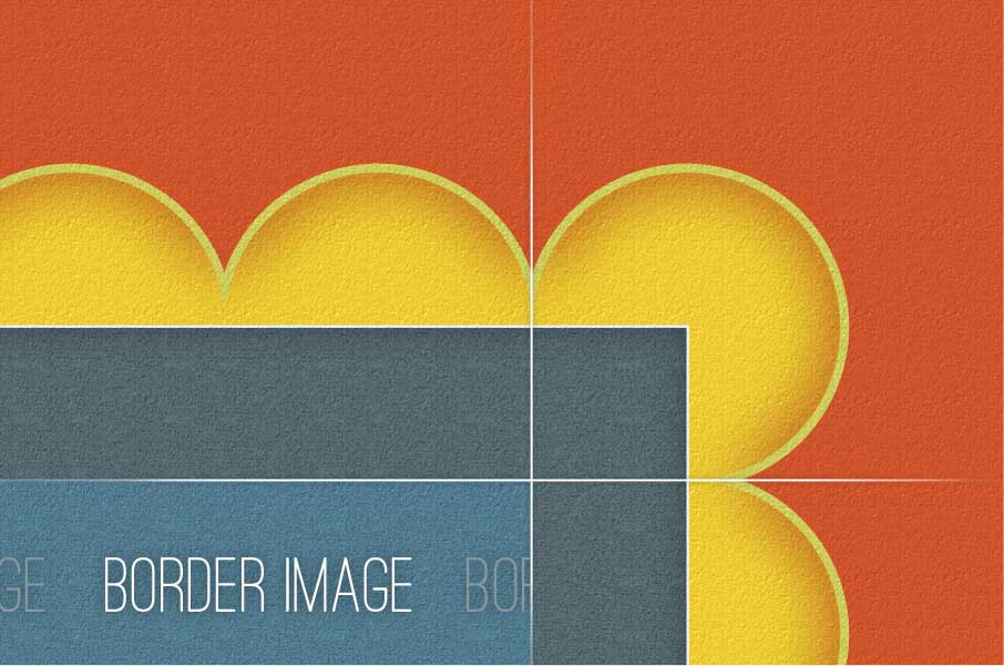
Border-image is a really great property that can and should be used right now. There are some decent fallbacks which gets covered later on in the article.
MDN is usually really great resource when it comes to documentation relating to HTML, CSS and Javascript but their border-image documentation is definitely lacking – I think it’s due to the absence of actual examples. The best resource I’ve come across for border-image is definitely the W3C spec – I can’t say I’ve said that before. That’s the reason I’ve decided to write this article – A resource that thoroughly explains the basics of the border-image properties with relevant examples.
What is border-image?
Border-image is quite self-descriptive – It allows you to use an image as a border for an element. Before getting into too detailed, here is an example:
border-image is shorthand for the following properties:
If these properties replaced their value counterparts, it would look like this:
[code lang=”css”]
.border {
border-image: border-image-source border-image-slice border-image-width border-image-outset border-image-repeat;
}
[/code]
the bolded properties are required, the others may be left out.
Where are the pixel values?
A typical example of a border-image property could look like this:
[code lang=”css”]
.border {
border-image: url(../img/border.png) 20 10 20 10;
border-width: 20px 10px;
}
[/code]
Numerical values are used instead of pixel values and percentage values are accepted too. The numerical values refer to pixels if it’s a rasterized image ( jpg, png, gif ) and co-ordinates if it’s a SVG image.
Every border-image-* property is heavily reliant upon the border-width property since no pixel values are set within the border-image property.
Vendor prefixes
Vendor prefixed versions of border-image only support the border-image shorthand and not border-image-slice, border-image-repeat, etc.
Now for the Border-Image Properties!
border-image-source
This property requires the CSS url function just like background-image property does. The image we provide here is the image that is going to be used as the border image.
[code lang=”css”]
.border {
border-image: url(../img/border.png);
}
[/code]
SVG
Svg elements are handled slightly differently within the different browsers – Firefox seems to rasterize the svg element and apart from IE9, seems to have the worst border-image support.
border-image-slice
This property accepts 4 values, just like the margin and padding property as well as an optional fill value:
[code lang=”css”]
.border {
border-image-slice: top right bottom left fill;
}
[/code]
The 4 numerical values
These 4 values cut the image into 9 parts. TopLeft, Top, TopRight, Right, BottomRight, Bottom, BottomLeft and the center piece.
border-image:

Now the same image with a grid overlay:

Obviously 4 numerical values are not required, there are shorthand versions just like the margin and padding properties have.
[code lang=”css”]
.border { border-image-slice: 10 10 10 10; }
.border2 { border-image-slice: 20 10 20 10; }
/* Shorthand version */
.border { border-image-slice: 10; }
.border2 { border-image-slice: 20 10; }
[/code]
Fill
You may be a bit unsure as to what exactly the 9th section of the image is for. Well, it’s up to you whether you want to use it or not, but it could be used as a pseudo-background. You have the option to completely ignore it and use the background property, or you could use this ‘pseudo-background’ by appending the fill value to the border-image-slice property. This ‘fills’ everything within the border with that section of the image. This fill image is either repeated or stretched depending on the border-image-repeat property. An example of fill in use:
[code lang=”css”]
.border { border-image-slice: 10 20 fill; }
/* or */
.border { border-image-slice: 30 40 10 20 fill; }
/* or */
.border { border-image: url(../img/border.png) 10 fill; }
[/code]
If the fill keyword is left out, by default the fill is not applied, HOWEVER: all vendor prefixed versions of border-image have fill applied by default and there is no way of disabling this option. A work around would be to have the center area of the border-image-source image transparent.
Ratio
The border-image-slice is heavily dependant upon the border-width property. Imagine these properties being linked by ratio.
border-width:border-image-slice. Let’s say we have a 30px border – 90% of the time we would make sure the border-image-slice matches the border width:
30px:30 – There is a 1:1 ratio.
If we have: 90px:30 – that is a 3:1 ratio. This means the border image will be stretched to 3 times its original size.
Bugs
The firefox doesn’t seem to actually set the slice area correctly while using a vector image. When the border-width increases, the slice doesn’t scale along with it. This defeats the point of using a vector image for a border image. Hopefully this will be fixed soon.
border-image-width & border-image-outset
These properties don’t affect the box-model. By default the border-image-width value is 1 and the border-image-outset is 0. Their values are multiplied by the border-width and rendered accordingly.
border-image-width
This value represents how large the border’s image should be. If you had something like:
[code lang=”css”]
.border {
border-image-width: 3;
border-width: 40px;
}
[/code]
The width of the border’s image would be 120px. The more the border-image-width value increases, the more the border’s image grows into the box model without affecting the box-model by layering itself on top of the element’s background.
border-image-outset
This value represents how far outside of the box-model the border image should be rendered. So:
[code lang=”css”]
.border {
border-image-outset: 2;
border-width: 30px;
}
[/code]
Would render the border 60px outside of the box model without affecting the box model.
border-image-repeat
This property attempts to solve a possible problem with the repeated border-image area. 4 possible values are accepted: stretch, repeat, round or space.
Stretch is the default value for the property. This value stretches the tile across the height/width of the element.
Repeat merely repeats tiles.
Round is the ‘magic’ property. It repeats this area, however if a whole number of tiles don’t fit in this area, the browser resizes the tiles so that it fits snugly. Currently only Firefox and Opera support this value. Any value Chrome doesn’t recognize in this property is treated as ‘repeat’.
Space is similar to round. A whole number of tiles must fit in correctly, otherwise the left over space is distributed evenly between the tiles. This is the only value that is currently not supported by any browser.
An example of each follows:
Cool Tricks
The stretching colours cause gradients! You can some pretty cool things with this:
Fallback
border-image overwrites the border-color and border-style properties or visa versa depending on which has a higher specificity. Make sure you apply border-image after the usual border properties for a ‘normal border’ fallback.
Alternatively, there is always a web-developer’s best friend, Modernizr.
As for IE support, there is CSS3PIE. Unfortunately I’ve failed to get this to work even though I followed the site’s documentation. I never have much like with CSS3PIE outside of border-radius and box-shadow, it’s probably something I’m doing wrong.
Firefox Nightly doesn’t yet have support for prefix-free border-image. Firefox Nightly 14.0a1 wasn’t able to render any example of border-image I had so I wasn’t able to see how well it faired with proerties/values Firefox doesn’t currently support, but I’m sure it will support the prefix-free version sooner than later.
Chrome Canary doesn’t yet support the border-image-repeat properties apart from stretch and repeat.
Great resources
If you don’t already know, HTML5Please is an excellent resource and lead me to border-image.com which is a great webapp that could help with any border-image development and understanding.


This is the best explaination I found on this property so far (though I wish there was more on outset). Thanks a lot !
the ‘What is borde-image’ JSfiddle example you give, renders no result to me, and i’m using chrome
Contrary to the article, Blink (Chrome) and Microsoft EdgeHTML (Microsoft Edge) now seem to be the ones lagging in support behind Gecko (Firefox).
I used the article’s JSFiddle fiddle to figure out that the
border-*-styleproperties have to be set to a value other thannonefor the relevant border image sides to get border images working in Blink. EdgeHTML requires that all fourborder-*-styleproperties be set to such a value regardless of the border image. This is nonsensical given that border layout doesn’t matter for absolute- or fixed-position elements like custom tooltips.Worse, EdgeHTML needs you to explicitly set the
border-*-widthproperties to0since it uses a non-zero default border width for all elements and uses this border width to offset the border image. It claims to supportborder-*-width: unsetfor the purposes of@supportsat-rules, but if an explicit0isn’t used, you end up with a gap between the element and border image.