The Web UI Patterns 2014 eBook from UXPin looks at examples from today’s most forward-thinking companies such as Pinterest, Yelp, Twitter, Spotify, Virgin America, Behance, AirBnB and more to match UI patterns to user needs.
They have graciously allowed us to post a few excerpts from the book here on UMS for you guys:
Input Hints
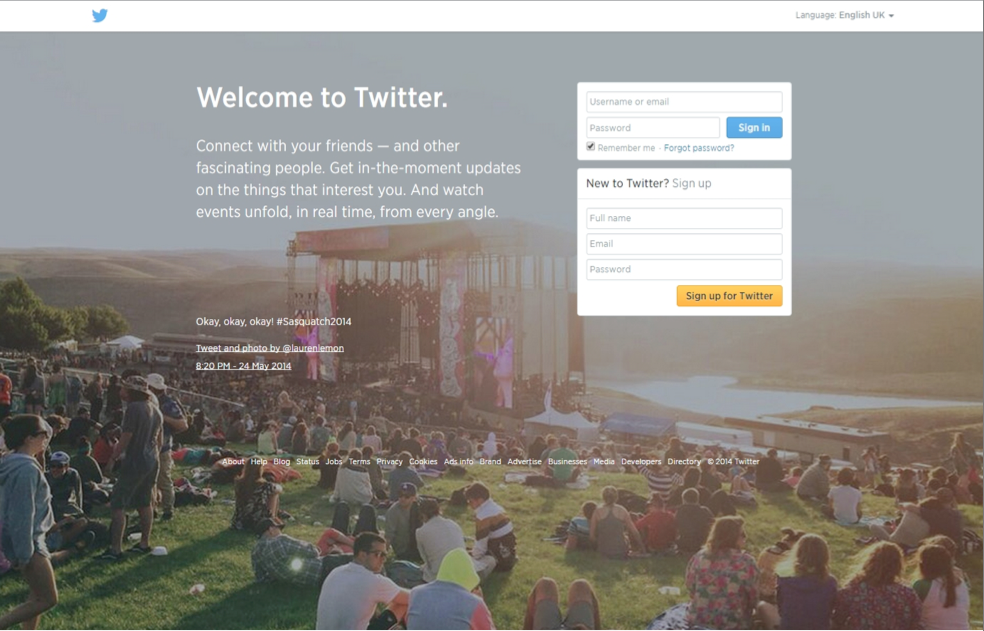
Problem:
The user wants to know what kind of data to enter into an input field.
Solution:
Show instructions, examples or hints to help users figure out what they need to enter.. Even if you aren’t using conversational patterns, you should still use input hints. For example, HTML5 allows an easy addition of inline text that can appear as placeholders inside the input field.
Alternatively, you can also provide hints and explanations as plain text below or to the side of the input field. You could also add a popover to appear when the user focuses on the particular field. The hint can stay visible for as long as the user is interacting with that field or it can disappear when they begin entering their own information.
Input hints minimize clutter around the input fields and eliminate user confusion and error.
Default Values & Autocomplete
Problem:
The user wants to complete actions quickly.
Solution:
Anticipate frequently selected items and make data entry easier for the user by giving them pre-populated default values or suggestions based on previously entered data.
YouTube for example automatically sets the language and region based on where the user is browsing from – this can be changed easily using bottom-of-the-page controls, but most users will never even need to think about it.
This can be paired with autocomplete functionality like in Google search, which speeds up the user’s actions but also serves as hints or guides for those who want to explore specific topics or themes. Google also prefills the country and phone country code based on the user’s location, eliminating extra steps.
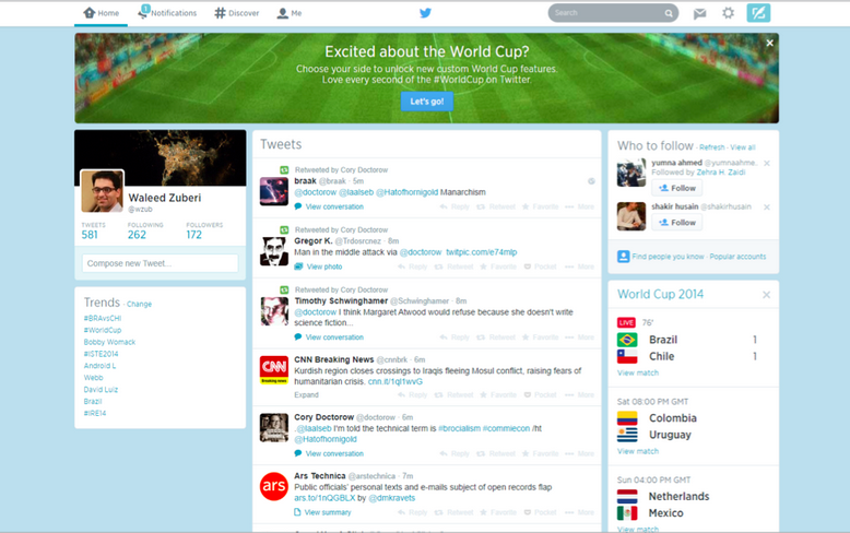
Twitter speeds things up by placing links to matched profiles in the search box so that the user can skip an interstitial search results page and go directly to the profile. This pattern is particularly useful in standardizing user input to better anticipate problems before they occur.
Discoverable Controls
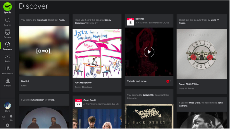
Problem:
The user wants quick access to controls that are secondary or only relevant to specific sections or content on the web page.
Solution:
Clear up the clutter and let users discover particular actions only when they need them. Users can usually access these invisible controls by either hovering over specific sections or content on the web page or scrolling through the website. This allows for certain actions to stay off-screen until it makes sense to use them, saving valuable real estate and offering a cleaner user interface. Individual settings for items in the Timeline on Facebook can be “discovered” behind a subtle triangle menu. Spotify uses a click-and-hold action to let users preview songs or playlists while browsing.
Recommendations
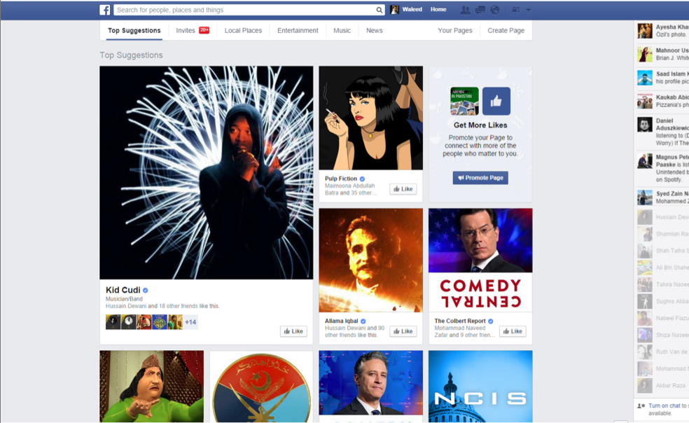
Problem:
The user wants to know which content to view.
Solution:
Show content suggestions and recommendations at various points to help the user browse through your content.
Using the information from the user’s profile preferences or their past interactions in the app, Facebook, Eventbrite, Spotify and Yelp among many others generate tailored recommendations for their users to help them discover new and related content or connections. These recommendations can come in the form of “popular” or “recently posted” items.
Facebook provides “related” pages based on the user’s interactions with posts in their timeline as well as a more dedicated recommendations section where users can discover new pages and people to follow. The stream of content available to users can be endless especially in social web apps that feature user-generated content; providing a robust recommendations engine in the UI can be a great way to help them discover new content.
Continued Reading
What’s in the e-book
The guide is around 200 pages long and includes screenshots and layouts.
Included are 63 design patterns/solutions to web UI questions such as:
- How can we guide users to the next logical step without making the experience too linear?
- How do we let users try things out without giving away too much?
- What are the key differences between large and small touchscreen devices that have led to new UI conventions, and what design patterns can?
- you use to best address these new practices?
- What is the best approach to giving users a digestible overview of new activity on their feed?
For a companion piece, you can also check out the Mobile UI Patterns 2014 eBook. Both e-books from UXPin explore how UI patterns should be treated like product features rather than stenciled outlines.


0 Comments