
Web Design Inspiration Curated
Indie Labs
Indie Labs are the guys behind Big Cartel, which is a really cool site for setting up simple stores for ordinary people. The site has a great mixture of simplicity and humor. The way the blog is presented on the home page is compact and clever. It's very hard to make...
Go Plan
This site is really well put together. It looks like it's a pretty solid product, at least from a visual standpoint. I kinda wonder if they can go up against the behemoth that is Basecamp, but why not give it a shot?
Vogelmuseum
At first glance this website looks homely but as you click around you realize that it is very well put together and almost every little detail has been hammered out quite nicely. The color palette will change based on different subject matter but not so much so as to...
Varien
This is a no-nonsense, corporate website design. Everything on it looks calculated and put in it's proper place, I like that. It utilizes a systematic approach to type use and color and which shows through to the final product here.
A Brief Message
Our mission for A Brief Message is a simple one : we want to give you design criticism in short form. We want you to do without. This is an ingenious little site with a bright future ahead if they can get interesting people to contribute. Stephen Heller is not a bad...
2440 Media
This is a very clean design with a well chosen color palette. The marquis areas really stick out and the photography, though well done, doesn't overpower anything else on the site.
kind company
This is a very simple layout. It reminds me of the Swiss school of design very much, maybe that's why I like it... Sometimes putting substance/content over style is what will drive your style to success.
Songpull
A songpull is a "video recorded event where 3-15 Songpullers get interviewed and perform their Songpull Songs on acoustic type instruments in front of other Songpullers and any number of spectators." and a Songpull song is an "original song that has not been performed...
John McWhinnie
Another well done site design. This one is very simple and relies on its typography to carry the weight, but it does so on a very capable level. Nothing too fancy here, but sometimes you don't need it...
stormlab
This is a very well crafted, executed site design. I love detail work and this site is deceptive in how it uses strong details to propell you through its content. The color palette is chosen well and looks fresh. The only thing i don't get is why the logo is fire but...
Grant Executive Jets
This is a neat website. It doesn't push the boundaries of web design but it is unique. It is a well crafted, well executed example of doing something different. The red plays off of the black and white imagery to a very good effect.
Legionary Studio
This website design does many things well. There enough little details to keep you scanning the page and the color palette is unique enough to make you take notice. Couple that with good typography and you have a winner. The snowman(esque) icon by the client login...
Worldways Social Marketing
This is an extremely well done site. From top to bottom, every detail has been worked out. The flash/animation isn't over-done and the color scheme is very pleasing. It's a fairly deep site with a lot of information but it's not overwhelming.
Mobile Web Design
Great one page design, lots of texture, great type choices and layout. The book is by Cameron Moll but the design is by 31Three, who do great work. I'm looking forward to reading this book, there are few books that I'm aware of that have tackled this area of web design.
Magento
This is a very clean design, with plenty of little detail work to inspire. I particularly like the execution of the sub-pages on this website, they all are slightly unique and chock full of information.
Forever Geek
I like the typography of the Forever Geek logo and how the colors play well with each other. This design seems to be falling apart a little as it's grown, but overall I think it's pretty well done.
26 bits
I really like the way the samples are placed at the top of the page, and the dark/black background works well here.
ProBlogger
This website/blog is very well done, from the grid system to the placement and sizes of the ads. I'm not that in love with the logo itself but I can overlook that because of the overall experience.
Corking Design
Corking Design's website incorporates earthy colors and simple layout to nice effect. The added texture of the woodgrain is a nice touch.
Giant
Honestly, I'm a bit hesitant in posting this. The design of this is great, the type is great, the layout is functional and attractive. Even though I can't read a word of it, I still want to click around. Giant seems to do good work also, judging from their portfolio....
EMAIL NEWSLETTER
News & Articles
No Results Found
The page you requested could not be found. Try refining your search, or use the navigation above to locate the post.
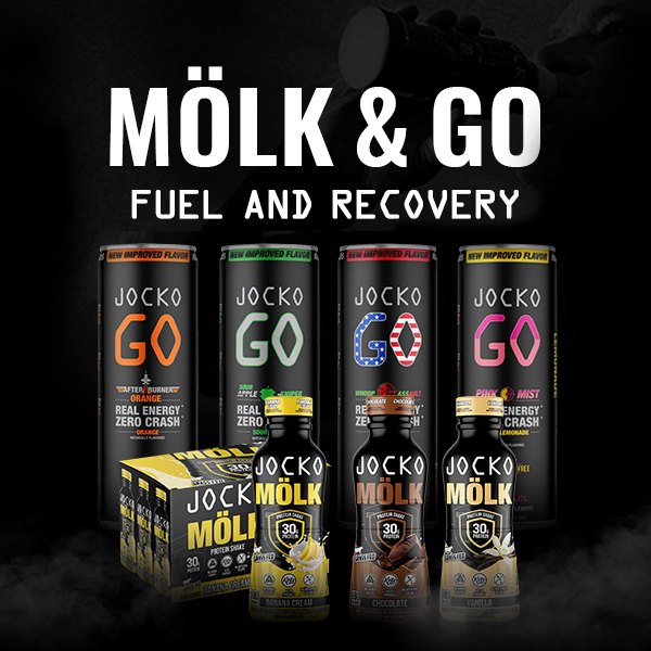
HARD WORK. CLEAN FUEL. NO EXCUSES
Use “WARRIOR2023″ for 10% off.