
Web Design Inspiration Curated
RMS Building Services
This is a pretty good site all around. Well organized and consistent. I'm not sure I follow the "quick contact form" but I can certainly understand how a project can go...
Wishlistr
I think Wishlistr has recently re-designed... I could be wrong. But I still enjoyed "discovering" this website design. I always like when a designer can utilize illustration in their designs and this one is quite nice. It's full of little details and good tight...
Brett Nyquist
This website design is one of the best one page/dark layouts i've seen in a while. I really like the way the samples are handled. It is all tied together nicely in a neat little "simple design" approach.
Mission Chamber of Commerce
I like how the colors work together with the photography on this design and are not just plopped in there. This design is surprisingly simple if you really pick it apart and I think that's the charm here.
Kindred Spirits
A very simple design here, but effective. I like the treatment to the top logo and how the main content is broken up into three distinct sections.
Destination Organic
I really like the background on this website and the colors play well together. I would have never considered red as a color to use in this type of subject matter but it turns out it works.
Marius Roosendaal
I really like the texture in this design, it's very subtle but you do notice it. The monochromatic color palette really highlights the designs when you open them. There is just enough detail work on this site to make it complete.
Fetch
We've all seen this type of layout before, but I really like this one, it's clean and they've managed to put all the info you need to make a decision on using them on the home-page.
LuckyOliver
This is a fun website, the design is loose and the content pretty well organized. I like the earthy "throw-back" feel to the colors and typography.
fullyillustrated.com
This site isn't new if you peruse the gallery review sites often enough, but I really love this one. It has clever artwork and the design of the site is created to really focus on that part of it.
Irvington Development Organization
I really like the colors in this design, the palette is smooth and pastel with out being overtly so. The type treatments used are nice and match well. Overall good use of photography -- it makes a difference.
happilycreate
I found out that if you say 'happilycreate' over and over again, it gets a bit weird. So I don't know if that a good thing or bad thing. Probably neither. Anyway, Robert Strickland's one page portfolio is a real beauty. I'm usually a sucker for wood-grained...
Your Jolly Dog
There's something about this website that I like. The image treatment and the tabbed menu seem to work for this design. The events pull out is a good idea as well.
Mark Forrester
There's something about this blog design that I really like, perhaps it's the illustration or simply the way Mark projects himself with his writing. Sometimes there's more to website than the visual presentation, which in this example is pretty darn good, but you...
Simply Invoices
I really like the green they chose, shows some guts and flair for the inventive. Overall this design is clean cut and straight-forward with is also really like. This product idea is a good one and the design supports that. Well done.
Stephen Colbert – I am America (and so can you!)
I love Stephen Colbert... 'nuff said...
Burnett Dairy Cooperative
I love the look of this site, it's perfect for the subject matter. The textures and colors evoke the farm, nature and history of this dairy farm. The store is well designed and integrated and easy to use. I just might have to order a box of sausage...
Rememble
I'll be honest, I haven't signed up for this, so I can't vouch for the application itself. But the site is very fresh. It's colorful, well-written and to the point. The timeline aspect looks interesting, I wish there was a larger screenshot to give me a better idea of...
Joystik
This site is the personal portfolio of Paul Seys. It's a little light on the content and work output, but he's really done a great job on his site. I love the darkness and the subtle textures that are going on. The bright greens and blues really pop out and add...
Judo Club
This one was in the gallery showcases earlier on, but it was just submitted to us and I have to admit I really dig this layout. Very user friendly and the pattern used in the header along with the color palette make this enjoyable to look at. I want to learn Judo...
EMAIL NEWSLETTER
News & Articles
No Results Found
The page you requested could not be found. Try refining your search, or use the navigation above to locate the post.
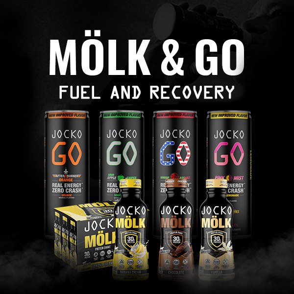
HARD WORK. CLEAN FUEL. NO EXCUSES
Use “WARRIOR2023″ for 10% off.