
Web Design Inspiration Curated
Elitist Snob
Not a new site to the galleries out there but I thought this one was too nice to pass up on. I really like the illustration and the Mac snobbery...
Here’s Life Mission Africa
This is a very well done website. From the background to the footer everything is well done. I love the fact that the designer has brought in the look of "real-world" effects in the Polaroid looking photo treatments to the torn paper edge. The footer is also a...
Postmachina
Very simple site, there's not much here, not even in the HTML... But I really like everything about it. The dark color, the type the logo - very nice.
Henry Jones
I really like this website design. It's so simple but very effective. I really like the woodgrain background and the typography is solid.
commun
This website is quite different from everything we've seen before. From the "recent work" links to the way the navigation is handled. It's simple but it's so different. I really like this design.
OnWired
Good looking design company website here. The colors are different enough from everything we've seen before and I really like the way the imagery is used - using real world "clever" elements in the design. They've brought just enough content to the home-page to...
grain edit
Not only do I love poking around on this site and reading the content, the design is a simple beauty. Like most blogs it has the three column grid layout but this design is clean and puts focus on the articles and article images - like it should be.
The 9513
Simply a great website here. I love it when a designer will work in textures and elements that are representative of real world "tactile" objects, but they always seem hacked in, this site does it well and doesn't beat you over the head with it. I love the three...
digitaloop/Nick Lee
This is almost a one page portfolio layout, I'm going to classify it as one of those for the sake of argument. Overall I really like this design, the dark brown color makes this a dark "black" design without using black, and the grid work is nice. Nick is a pretty...
redrelevant
This is really well done website. It gives you plenty of information (content) on the company and at the same time it is complete enough design wise to leave you fulfilled visually. I like the red color and all the little details worked into it. Good job guys.
Nuwen.com
Nice "liquid" layout, I love the dark colors and the overall approach of this design. It's not often a "liquid" layout is done as well as this one.
Design Council UK
This is a very interesting design, I like the way each block of text is encased in it's own area. It does begin to fall apart as I think the designers tend to "buck" expected design patterns such as the placement of the logo, but overall there is no harm there,...
Pixel Air
The Pixel Air website is a great example of a simple design approach done right. I love the colors and the layout a lot. Good detail work and the portfolio section is full enough to show me what I want to see.
ever.cz
This website is daringly clean and simple. I like the sparseness of the design and light colors really help to focus you on the work samples.
Emeril’s Holiday to Go
I admit it, I am a fan of Emeril's. His Holiday to Go site is pretty good to. The design hits the "holiday" motif right on the nose and doesn't overdue it and it's put together pretty well too.
Arktyp
This is a pretty nice looking design. The five column design is unusual but it works. The code is sort of div crazy but it's hard to argue with the end result.
Poccuo
This is a very nice looking grid based website. I especially like the way the "work" and "inspiration" portions are worked into the homepage. Very well done.
ChamaDigital
A rather refreshing site to look at, the background image is very different from your average website and the extra detail work around the main image are intriguing. I think the portfolio section could use a little more fleshing out, I like it when I can see better...
Burnett Dairy Cooperative
This is a great looking site. The information is placed perfectly, it has the right amount of imagery (good imagery) , the colors are right on and even the code is clean. I like the product detail pages in the store section too.
Faust
This design reminds me of the Swiss School and I really like it. It's almost all in one page, technically it looks like it's loading multiple pages. It's a bold simple design, and well done.
EMAIL NEWSLETTER
News & Articles
No Results Found
The page you requested could not be found. Try refining your search, or use the navigation above to locate the post.
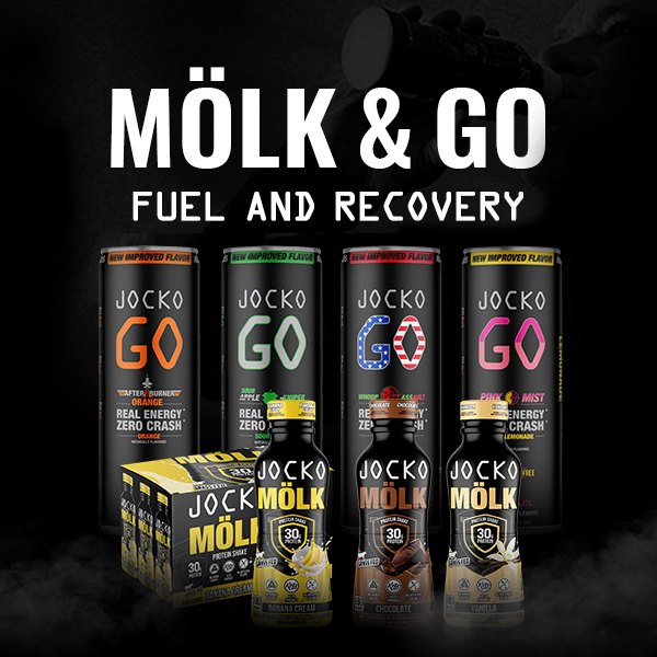
HARD WORK. CLEAN FUEL. NO EXCUSES
Use “WARRIOR2023″ for 10% off.