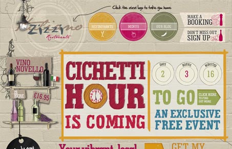
I like the sketchiness to the background imagery. The overall experience of this site is fairly non-linear, in that each page or section has some different look & feel details here and there. That keeps it fairly interesting. It’s also one of the few times i’ve come across a hybrid site with flash and HTML5 stuff in it at the same time lately. Pretty interesting.


0 Comments