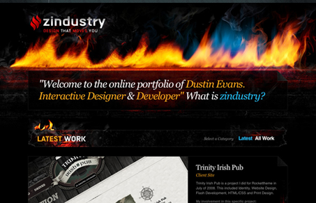
I like the imagery used in this design, even though there just might be a little too much of the fire visual, I really like it. It’s well done and the texture that gives to the rest of the site is much needed. I also like the large images used for the work samples and the mouse-over effect from going from the washed out mono-chromatic image to the full color.
The other thing I’m liking is that there’s just something about this site that’s vivid to me, it just looks really clear and crisp even though there’s a lot of photo work and texture.


I imagine it being hard to work with fire as a graphic and the textures that go with it and he does it well here. I also like how the footer area can be switched out by the “extra” and “get in touch” links.
I might suggest he work more on his typography/spacing. I just get the feeling there’s too much going on type wise here.
Dustin is obviously a very talented designer and the work examples are impressive, but I find that the fire theme is so strong that it makes me less likely to want to read and click around. The examples and type just recede into the background compared to the fire, which jumps off the screen.
I’m following Dustin for a longer time now.
For me design always has its creative spark in the content.
Most of the work that is shown on his site was done for the template-industry.
It’s pretty remarkable how creative he is even without content (just with demo stuff). Probably he is not a designer suffering from boredom 🙂
That’s a great point Henning, that Quantive template is pretty dang nice!