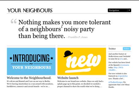
Really great looking typography balanced well with some nice imagery for each post. The big drop down selector/navigation that turns into a mega-dropdown type thing is also pretty well done. Once critique would be that I have no idea what the site is for, I’m assuming this is a web design shop or cooperative of some sort. I think it would be hugely helpful to have just a little intro or elevator pitch right up front somewhere easy to find. I see there’s an ‘about us’ page but that may be asking an awful lot for people to find that easily. Other than this, i think it looks and works quite well visually and worthy of study as a good design.
Looking Fast: The Art of Website Speed Perception
In the web world, technical speed and user perception matter. By improving design for a faster appearance, you boost conversions and stand out online. Speed isn’t just loading time; it’s perception.


Thanks for your feedback, we’ll definitly take that into account when we’ll tweak the website anytime soon.