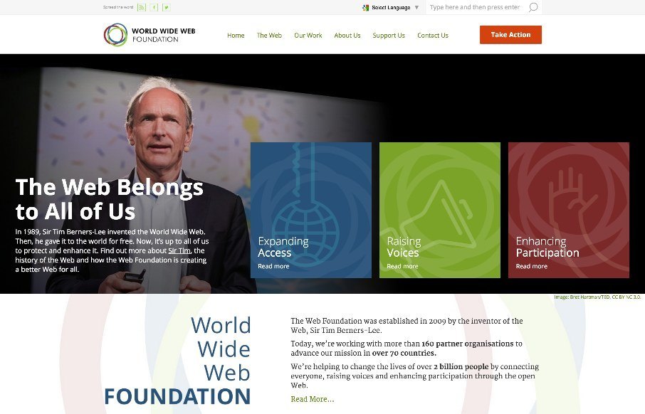
Solid, solid design here. There’s a lot to this design but I only want to look at one thing for this write up. Take a look at the screen layout changes between what looks like iPhone and iPad – the marquis areas break out of being on top of the hero image to go underneath it, but on the wider screen sizes they lay on top of that area. That’s a great design pattern to emulate for other websites. Love it.
Looking Fast: The Art of Website Speed Perception
In the web world, technical speed and user perception matter. By improving design for a faster appearance, you boost conversions and stand out online. Speed isn’t just loading time; it’s perception.


0 Comments