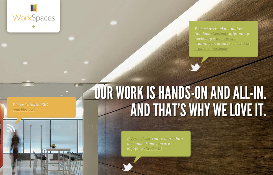
I love the look and execution of the WorkSpaces website. The responsive design and parallax effect with the main images is quite well done. It gives an overall timeless feeling design some current edge. Typically I don’t like it when a design hides navigation items like this one does with the main navigation block/widget, but the content just feels accessible, even with out it, it’s like when you find it and start exploring you’re just getting more info on top of info you’ve already kind of learned. That’s a nice touch for the overall content experience that I really enjoy here.


Glassmorphism: The Transparent Design Trend That Refuses to Fade
Glassmorphism brings transparency, depth, and light back into modern UI. Learn how this “frosted glass” design trend enhances hierarchy, focus, and atmosphere, plus how to implement it in CSS responsibly.


Hi Gene,
Thank you so much for your feedback on our new website. We are extremely excited about it and the positive response that we’ve had from the industry and beyond. We are huge fans of Blue Ion as well and we are excited to continue working with them on future projects.
Regards,
Heather Davis
CMO
WorkSpaces LLC
You bet Heather, obviously we’re fans of their work here too!