
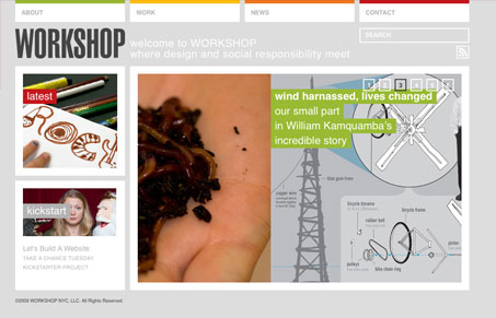
I love the sharp angular and boxy feeling to this design. It’s small and cramped feeling but I like it in this case. It’s so clean and easy to use looking. The only thing that bugs me is how light all the gray text is, it could be darker, but the site looks great and I really love the simplicity of it all.




0 Comments