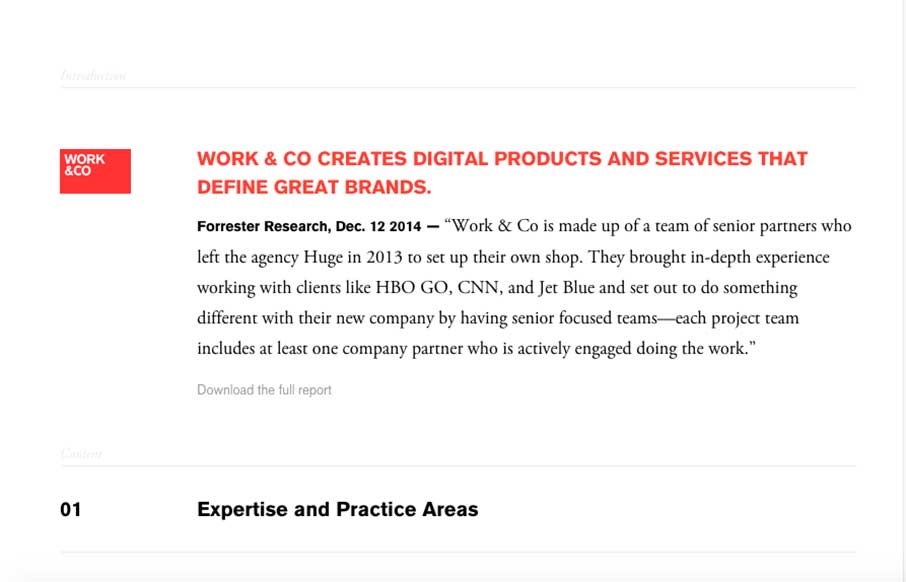
So… at first I wondered if I was getting into a blog with the way the Work.co flows at first – but there were hints that this was going to be an subtle intro to the rest of the site – ended up loving this site! Love the page layout of the navigation – you scroll down a page to get the Menu button – then it splays out in front of you – like this mini-trend. Fun site!
Glassmorphism: The Transparent Design Trend That Refuses to Fade
Glassmorphism brings transparency, depth, and light back into modern UI. Learn how this “frosted glass” design trend enhances hierarchy, focus, and atmosphere, plus how to implement it in CSS responsibly.


0 Comments