wordrefuge.com

wordrefugecom

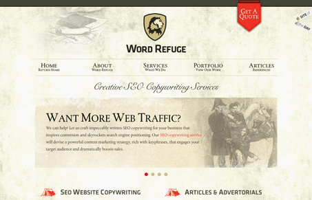
Love the two column layout on the home page. The tone of the coloring and textures makes this site inviting and classic. The red is a great addition in places that demand your attention. I like the “get a quote” form fly out too, I’ve seen that type of thing before and I always wonder if it helps get more form submissions than a typical form page/layout. Seems like it would.

0 Comments

Submit a Comment

Your email address will not be published. Required fields are marked *

News & Articles

Looking Fast: The Art of Website Speed Perception

Looking Fast: The Art of Website Speed Perception

In the web world, technical speed and user perception matter. By improving design for a faster appearance, you boost conversions and stand out online. Speed isn’t just loading time; it’s perception.

Designing for Errors: Creating User-Friendly Contingency Plans

Designing for Errors: Creating User-Friendly Contingency Plans

Contingency Design hinges on empathy, understanding user frustration, and transforming errors into positive impressions. By embracing these principles, you enhance user experiences, retain customers, and boost revenue in the competitive digital landscap