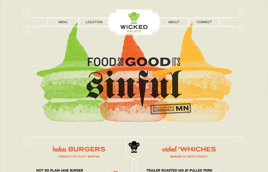
Holy cow, this is how all restaurants should do their websites. It’s a single page that uses anchors to scroll you down to the section you need. It’s mainly a menu. Then it’s responsive so you can see it on your iPhone, which I don’t know about all of you, I’ve pretty much only ever looked up restaurants on my iPhone… Perfect, lovely, I want to eat there now.


The Call to Action, Revisited
The Call to Action hasn’t changed in a decade, but the bar has. A fresh look at prominence, copy, mobile tap targets, and accessibility, with lessons from three major design systems.


0 Comments