
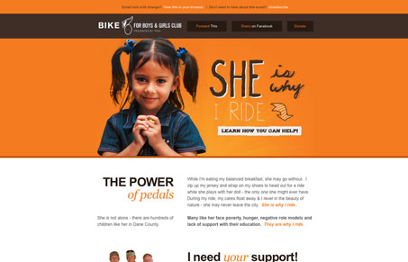
Love this email newsletter design. The orange will really stick out in the noise of my inbox and it’s just strikingly beautiful to look at. One issue I find with it is the call to action, linking an anchor to the footer area where the user can choose two directions to go with their next step might be a little muddied up. I just think the call to action is so strong and powerful next to the little girl’s image that it’s hard to pass up. Otherwise this small technicality this is really a beautiful email design.




0 Comments