Why I Ride

whyiride

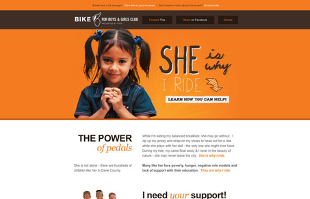
Love this email newsletter design. The orange will really stick out in the noise of my inbox and it’s just strikingly beautiful to look at. One issue I find with it is the call to action, linking an anchor to the footer area where the user can choose two directions to go with their next step might be a little muddied up. I just think the call to action is so strong and powerful next to the little girl’s image that it’s hard to pass up. Otherwise this small technicality this is really a beautiful email design.

0 Comments

Submit a Comment

Your email address will not be published. Required fields are marked *

News & Articles

Looking Fast: The Art of Website Speed Perception

Looking Fast: The Art of Website Speed Perception

In the web world, technical speed and user perception matter. By improving design for a faster appearance, you boost conversions and stand out online. Speed isn’t just loading time; it’s perception.

Designing for Errors: Creating User-Friendly Contingency Plans

Designing for Errors: Creating User-Friendly Contingency Plans

Contingency Design hinges on empathy, understanding user frustration, and transforming errors into positive impressions. By embracing these principles, you enhance user experiences, retain customers, and boost revenue in the competitive digital landscap