
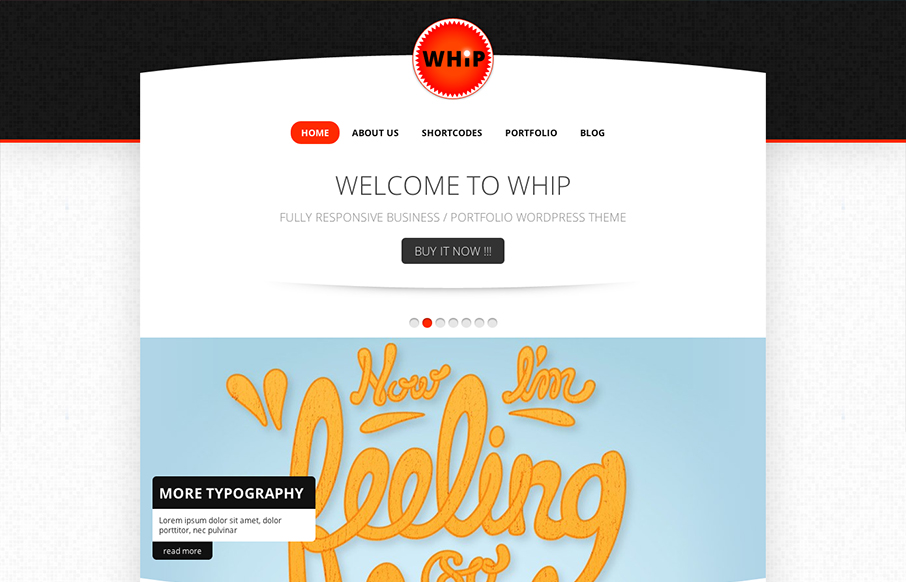
We don’t post too many theme designs here on UMS. I happen to like this one on it’s design merits alone. The circle design elements work really well to me once you get past the main hero image/slider. I can take or leave the main navigation design but it’s all well blocked in together visually. Overall it’s a great website design, even removed form being a theme.


Fitts’s Law: Why the Easy Button Wins
Large, close targets are faster to hit than small, distant ones, that’s Fitts’s Law. A look at the 1954 rule behind buttons, prime and magic pixels, thumb zones, and dark patterns.


That is a nice theme. But all that work to then go and slice the drop shadow off on the main logo.