welovecreativity.com

welovecreativitycom

Submitted by Blaine R, @wlcreativity. Role: Designer & Developer.

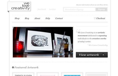
Deceptively simple website design. I like the stark gray and white design, but there’s actually a lot of well done detail to be discovered. From the roll overs used across the site to the bread crumb design on sub pages this website’s experience is quite gratifying. I also dig that the designer didn’t actually use any 3rd party icons on the social networks and stuff, nice finishing touch imho…

1 Comment

  1. Blaine

    Thanks Gene for the kind words!

    The idea behind the design was to highlight the artists’ work, preserving it as the main focal point. Only when a user would interact with the site, would it come to life through subtle visual cues.

    Reply

Submit a Comment

Your email address will not be published. Required fields are marked *

News & Articles

Looking Fast: The Art of Website Speed Perception

Looking Fast: The Art of Website Speed Perception

In the web world, technical speed and user perception matter. By improving design for a faster appearance, you boost conversions and stand out online. Speed isn’t just loading time; it’s perception.

Designing for Errors: Creating User-Friendly Contingency Plans

Designing for Errors: Creating User-Friendly Contingency Plans

Contingency Design hinges on empathy, understanding user frustration, and transforming errors into positive impressions. By embracing these principles, you enhance user experiences, retain customers, and boost revenue in the competitive digital landscap