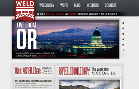
This is a very striking site. The bold, large type, rich red and large photos really make an impact on the first visit. The condensed fonts coupled with the italicized serif is a good pairing. When you get to the blog on the left, however, I’m not sure the addition of the slab serif is needed, plus the text shadow over the diagonal lines make it slightly hard to read. Perhaps that’s one font too many? (As an aside, this site uses Typekit, and it’s a new and welcome problem of having too many good typefaces to choose from.) As you scroll down the page, the way they handle the tweet is interesting, not only do they show you their latest tweet, but you can toggle between a couple of hashtags.
So while the design is really nice, it took me a bit to figure out exactly what ‘Weld’ is. The title is ‘Content Marketing for Adventure’, but this is only in the title and I don’t see the word content anywhere but in the blog post. The photos are beautiful but have vague headlines like “We’re Welders” and “Abroad with Oars”, and the main statement under the nav says “We believe adventure, adrenaline and wild places enrich lives and change people for the better.” These might be catchy but believing in something tells me nothing about what they do. Not until the work and ‘welders’ page do I see anything about telling stories, which seems like a much more succinct way of putting what they do, which is:
These folks see a big wide world that everyone should experience in thrilling fashion, and they know how to tell stories that get you to want to come along.
I think something like that is much more appropriate for the home page.


Hi Jay. Thanks for the writeup and the feedback- good points, all. Much appreciated. We’re re-working the “what we do” copy (currently a list) on the WELDology page; have to think about transferring some of that thinking to the home page. Cheers.
I like “striking” as an evaluation. @ethangeyer did an amazing job of creating distinctive voice in design.
Disclosure: I’m a #WELDer and I’m partial to stretching an edge and starting a conversation. That’s what #PatrolZ is about.