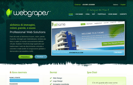
Really nice texture and colors used in this site design. It’s a layout type that i’ve seen a lot of, but when it’s done well it’s pretty good, like this one. I’m not normally a fan of the big header space with extra content in the negative/white space below it used in design but they’ve manged to make it work. The contact us page is a particularly good example of making it work.
Glassmorphism: The Transparent Design Trend That Refuses to Fade
Glassmorphism brings transparency, depth, and light back into modern UI. Learn how this “frosted glass” design trend enhances hierarchy, focus, and atmosphere, plus how to implement it in CSS responsibly.


Looks like they have issues paying their designers, though: http://twitter.com/priestap/status/1182000786
Nice job, @priestap on this beautiful design. Boo on webgrapes for stiffing the designer!
Well, that settles it, right? It would nice to have a little more context than one tweet before there are accusations thrown around about stiffing designers. I don’t know anybody involved in any of this, so it would be great for someone to shed some light on the subject.
Jay,
I’d be happy to fill you in privately — I don’t wish to say any more about it publicly since their debt is forgiven. My website has a contact form.
http://www.designwisestudios.com
Respectfully,
Mark Priestap
Owner, Designwise Studios
Currently working with WebGrapes and loving it. They’ve paid regularly and in full.
Ryan – I’m glad to hear it – sincerely. Thanks for mentioning it.