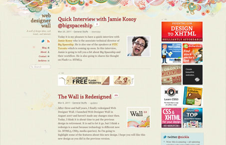
The redesign of Web Designer Wall makes great use of the ideas behind responsive web design (media queries). I also love the fixed navigation section on the far left column. The striking background illustrations the site was first known for have been minimized a good bit, while i do miss it, it’s an improvement. Putting the content front and center over the illustration is good move and a smart one I think. What’s also great as there’s been such care given to the redesign, the print stylesheet even looks great, which is great for those tutorial posts you may want to review off the screen. This site has been long known for such great content why not put more of the visual focus on the content? Really great design again here!
Here’s his post on the redesign.


0 Comments