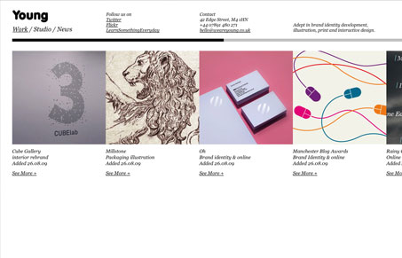
I think the non-traditional look works well for this site. It did take me a minute to realize that black bar was a horizontal scroll haha. The minimal design leaves them a lot of room for them to show off their work and even “about us” graphically.
Glassmorphism: The Transparent Design Trend That Refuses to Fade
Glassmorphism brings transparency, depth, and light back into modern UI. Learn how this “frosted glass” design trend enhances hierarchy, focus, and atmosphere, plus how to implement it in CSS responsibly.


Absolutely shocking. Too lazy to get the webste to render in IE6 or 7. We all hate IE6 but it shows a gross misunderstanding of the public and your audience. Maybe they’ll fix it when the release weareoldandwise.co.uk
I don’t know though Chris, if you are “young” wouldn’t that imply that you don’t care about IE6 & 7?
It always amuses me when someone looks in on another person’s business (literal business, not personal business) and devises that their design is wrong because it doesn’t render in IE6 or 7 without any knowledge of what the browser share for that site is or without acknowledging the business’ demo.