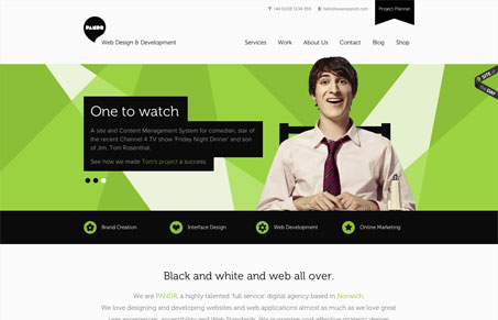
I like the overall look of this site and I love the detail work. The illustrations all flow really well with the rest of the design and typography – it even matches the photography pretty well. The tone is nice and easy to detect in both the design and copy. I especially like the project planner form page. It convey’s how these guys approach a project at the same time as gather the information.
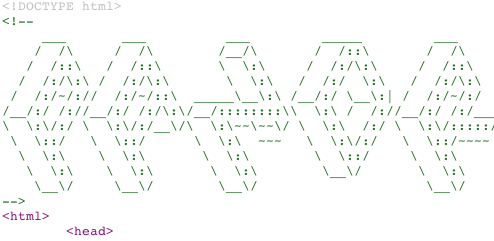
Also, I love the ASCII tagline/logo in the HTML.


Actually found this myself earlier today for the first time, incredible and inspirational design
It’s a nice one for sure.
Not bad, though the use of Museo Sans troubles me. This is the comic sans for us web designers.
I think Comic Sans is the Comic Sans for web designers. Museo is a great typeface and it works really well on this site. Don’t forget that the reason that Museo has been used so much is that it was given away for free AND was a great typeface. That was a bit of a revolution and by using it hopefully we can encourage more of the same by other font designers.