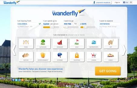
The Wanderfly home page is quite interesting. This home page is pretty much a big search form. I like the slider form elements, they are easy to use and you quickly understand how to use them in context. The other selection elements are fun to use as well, even if you have to slide back and fourth to see them all. It’s a little bit of a letdown that the rest of the site is all flash driven but the home page is not.
Looking Fast: The Art of Website Speed Perception
In the web world, technical speed and user perception matter. By improving design for a faster appearance, you boost conversions and stand out online. Speed isn’t just loading time; it’s perception.


The two first steps are well designed, but I find the result’s presentation of the search a bit too condensed and heavy.
It doesn’t really feel like a form, so I was a bit confused when I clicked on one of the boxes and nothing happened. I also noticed that the next page is 100% Flash, even though the home page is not.