Via @mariafrey
Did I miss this or have you not seen it before either? jpeg atop animated gif. jpeg opacity:0 on hover exposing gif http://walkingwallofwords.com/
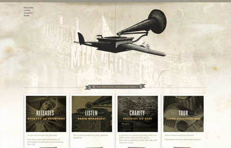
This site has some nice illustrations. Everything seems to work well together when you look at the color scheme, textures, and type. There’s a slight vertical parallax that is subtle, but a nice touch. I have to say my favorite parts are the animated GIFs. I know that probably sounds like an insignificant thing to zero in on, but the way they utilized a seemingly simple (and old school) element proves that you can do a lot with a little. The technique is used in a lot of places throughout, but I think it works best when you hover over one of the 4 boxes on the home page. The grainy animation was totally unexpected and, for me, it seemed to really add the “feel” to the “look.”
There are parts of the site that I’m less sure of. I’m personally not a fan of the page you’re on disappearing from the navigation. Also, the bottom area that pops up when you scroll down past a lot of empty space seems to be wrong or forgotten. From a content standpoint, I think the site could pull it together a bit better, but I think there are some out of the box visuals working well here that I felt should be recognized.


0 Comments