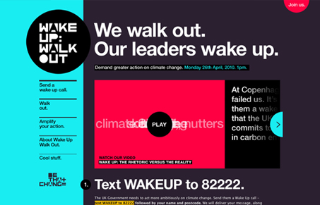
For me this is borderline to call it a “single page” layout. We really need to figure out a proper term for these sites that use the javascript sliding from loading each page. Technically it’s a single page, but it’s designed like a traditional page with a navigation and pages…
I like this type heavy design, the dark colors make it have good impact. I like the way the “join us” form is delivered in the light box type pop-up. Good looking clean design.


0 Comments